

The Economy Is People
A state of the union ahead of America's 250th

July marks the 250th anniversary of American independence. To lay down a milestone at Forces of Production, we explore the state of the union by surveying its most basic economic geography. As usual, we will end on a presentation of This Month’s Data. To discover the state of the union, we must go state by state asking: what do all these places do? What do they make? What services do they provide? What makes them unique? What do people there do all day, and what 21st century economic challenges will they face?
The American economy, when you really look at it, is mostly people.
They are spread out across the union, working at jobs they partly get to choose and partly are forced into by the broader economy and labor market. The things that Americans do all day — and the buildings and equipment that they work on and in — determine the short and long-term capabilities of our shared economy. What we can produce depends on what people know how to do and the tools they have to do it with. The institutional arrangements — who owns what, who pays for what, how markets and governments divide up the work — determine who benefits from these capabilities, and how. The question which is really at the heart of industrial policy and macroeconomic governance is the question of which capabilities we want to build, and how we want to coordinate them.
Much of the economy of the 21st century will be organized around the needs of the growing services sector. Manufacturing remains important, and it is crucial to retain and update existing capacity, but the service economy is where most Americans already work, and its share is only growing. In terms of scale and scope, 21st century economic policy will need to take a much more intentional and proactive stance towards managing that service economy.
Programs to reorganize the structure of provision — rethinking not just who pays for services, but how they are delivered — may become a requirement to free up squeezed labor supply for other purposes. Consider healthcare, which the Centers for Medicare Services projects to reach 20 percent of US GDP by 2030 and which already employs as much as a quarter of all workers in some states. That is an enormous claim on our national resources, and the way we have chosen to organize that claim matters. Right now, our healthcare system is made extremely complex in order to ensure adequate profitability for every link in the privately provided chain. Where the government intervenes, it does so to provide funding for both customers and businesses in the sector — through Medicare, Medicaid, subsidized insurance, and tax breaks — but not to coordinate the actual provision of healthcare.
This drive to profitability has created a sector which is massively bloated compared to the international standards set by countries which often deliver better and more comprehensive care. Regardless of the extremely strong moral case for universal provision of medical care free at point of access, there is also a clear macroeconomic case that the incentive structures of the private market are the wrong way to allocate investment and employment in the care sector. With labor supply structurally impaired by low immigration rates, and fierce demand for labor from the healthcare sector in particular, we have to ask whether market-led competitive private provision of medical care will really be the best use of resources in the long term. In next month’s edition, we will begin articulating the case for stronger public provision of essential goods and services, as part of a broader engagement with the real political possibilities that a coherent approach to the supply side can offer.
But for today, our goal is not only to make this case, but to survey the pieces we have to work with in constructing a new approach to coordination and provision. We will be looking at this geography using the most basic drivers and outcomes in economics: population, employment, investment, output, and the government. Since our economic data does not go back nearly so far as 1776, our retrospective will cover a somewhat shorter period. When this country was founded, it was mostly farms and plantations, but it has industrialized in its expansion and by the 1940s we started to get real economic statistics. Since our goal today is to understand the forces shaping the 21st century economy, we will keep our aperture locked on the last 25 or so years.
Output
The US economy is huge — $23.9T in output every year, or about 22 percent of global GDP. Our question today is: where is that economy exactly?
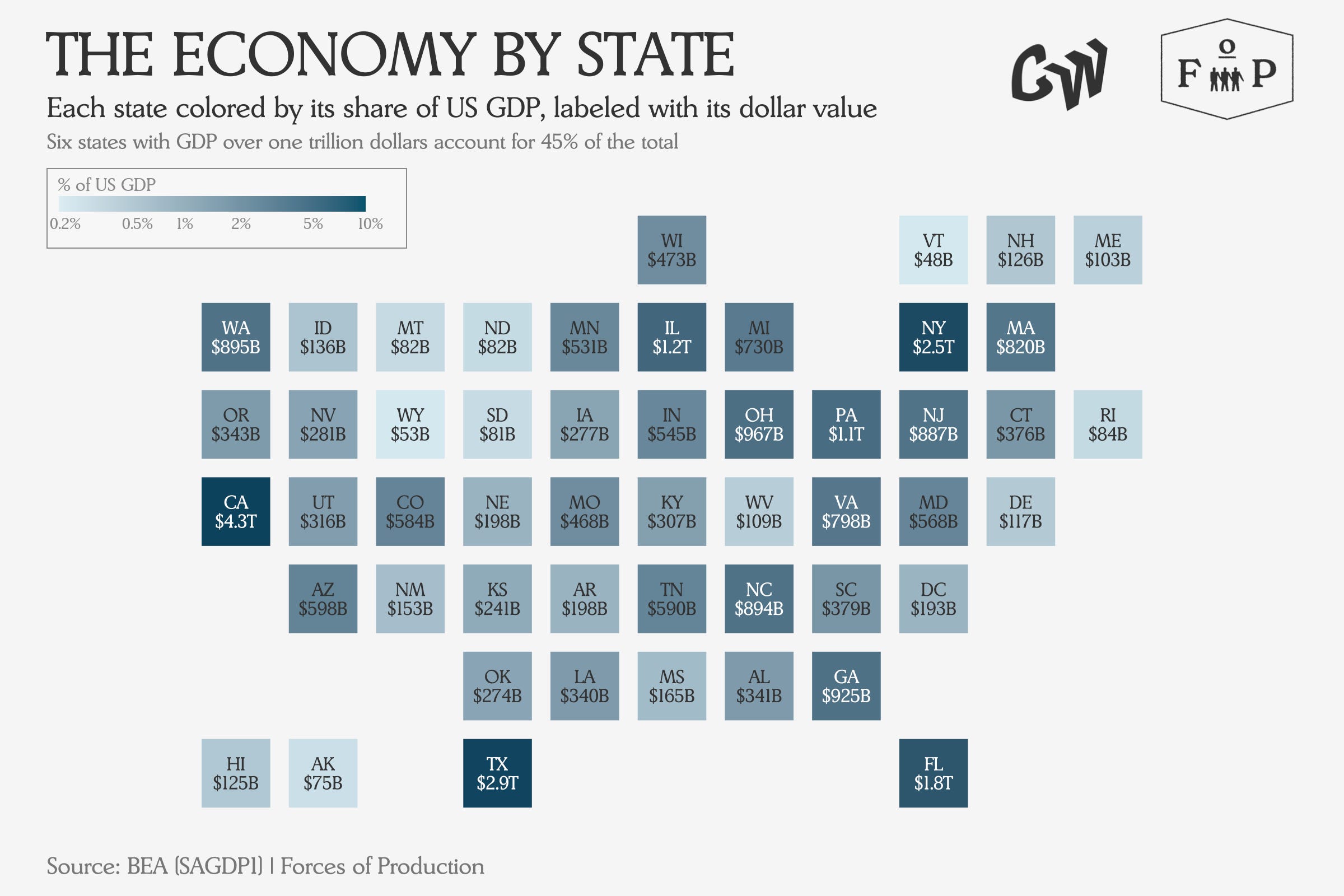
In this map, each state is shaded by how much of that total it accounts for — darker means a bigger slice — and you can see immediately that the economy is not evenly spread across the country. The heavy hitters are basically as expected: California, Texas, New York, Florida, Illinois and Pennsylvania each produce over a trillion dollars per year. These six states would individually be the 4th, 8th, 11th, 15th, 20th and 21st largest national economies respectively, were they to each declare their own independence next month.
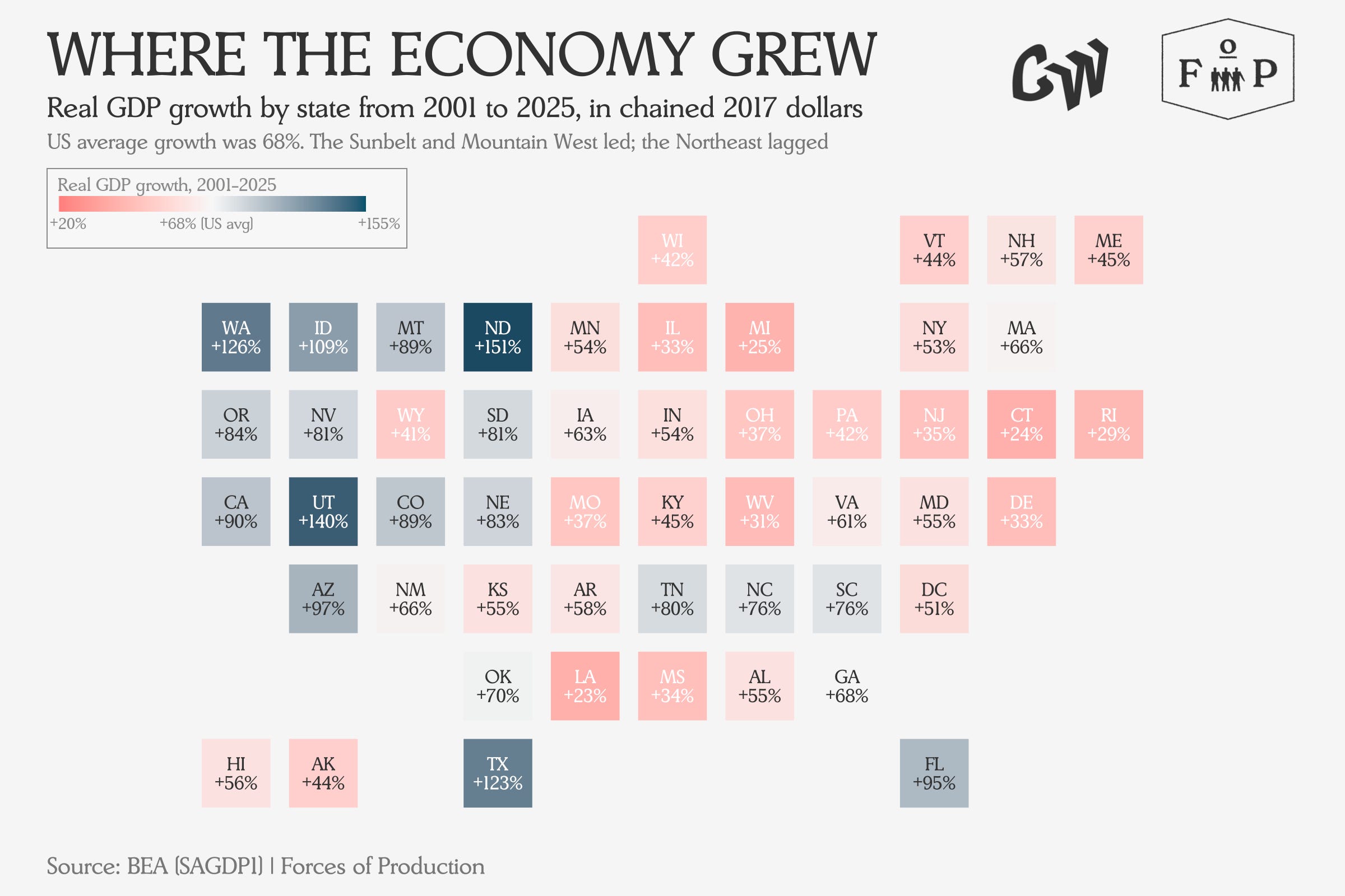
This map shows each state’s total GDP growth over the period in inflation-adjusted terms, with states that grew faster than the US average in teal and those that lagged in coral.
Those six biggest states split into two clean growth trajectories over the last 25 years. New York, Pennsylvania and Illinois saw their GDP grow by an average by 43 percent. Meanwhile, the sunbelt states of Texas, California and Florida grew by an average of over 103 percent. This is a massive difference, which will continue to compound and shape the geography of US growth. But why is the difference so big, almost 2.5x?
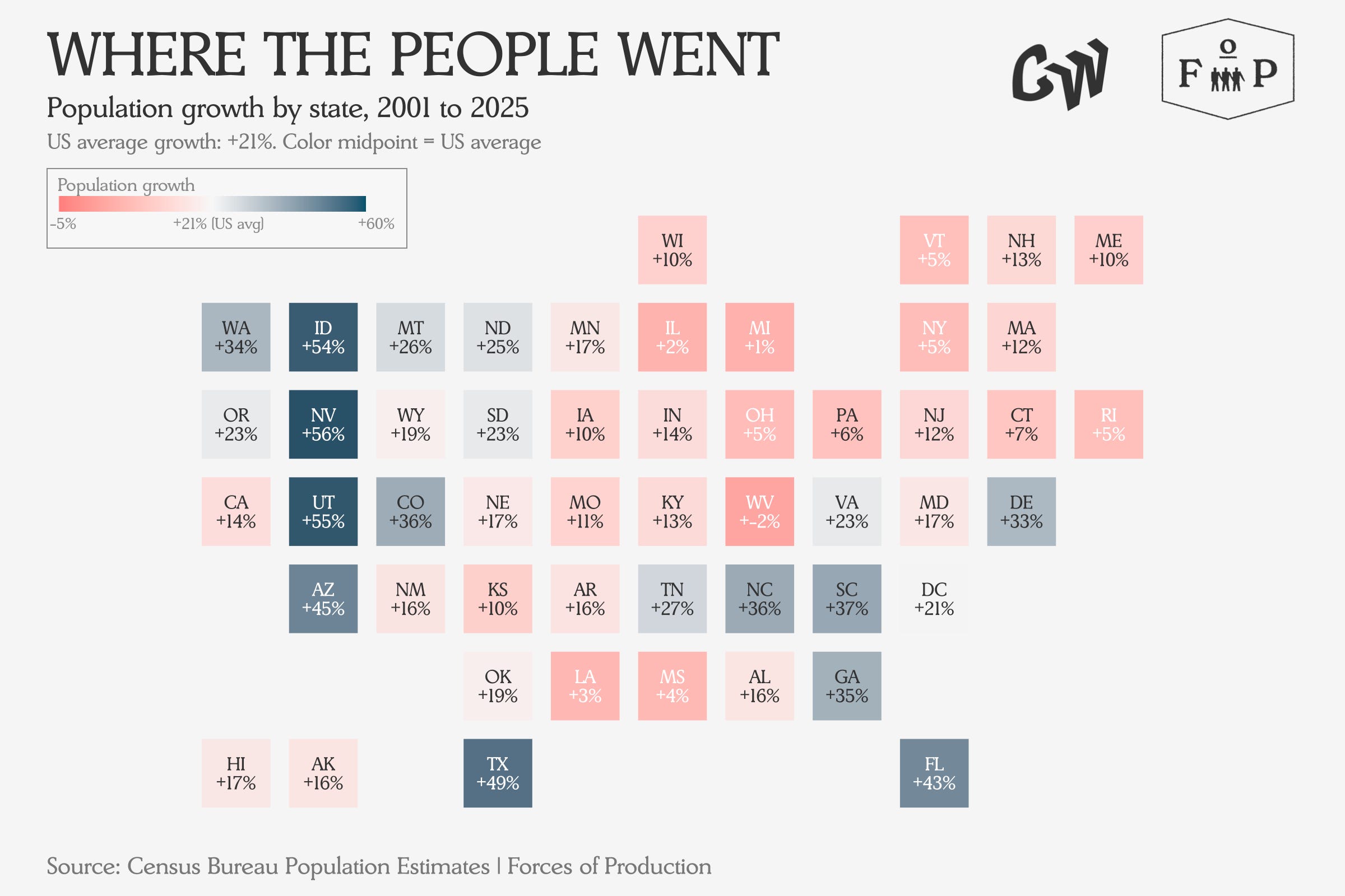
As you might have noticed, these six states are also the six largest by population. The difference between high and low output growth states is simple — population growth. In the slower-growing northern states, population grew by an average of four percent, while in the fast-growing sunbelt states, state population grew by an average of 35 percent over the same period.
The economy, like Soylent Green, is mostly people.
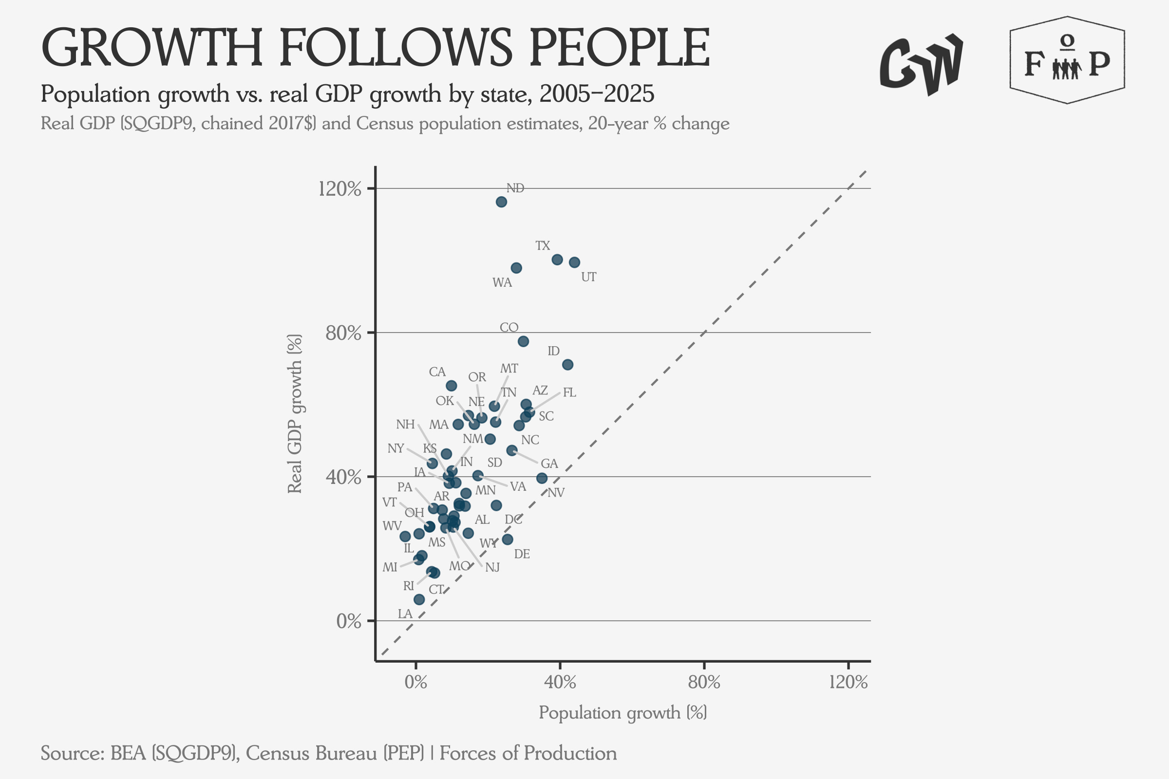
Each dot on the chart above represents a state. The dashed line marks where GDP growth would equal population growth exactly — the fact that nearly every state sits above it shows that output grew faster than population almost everywhere.
Employment
So firstly, what do Americans — at least the 60-odd percent of them who are currently employed — do at work all day?
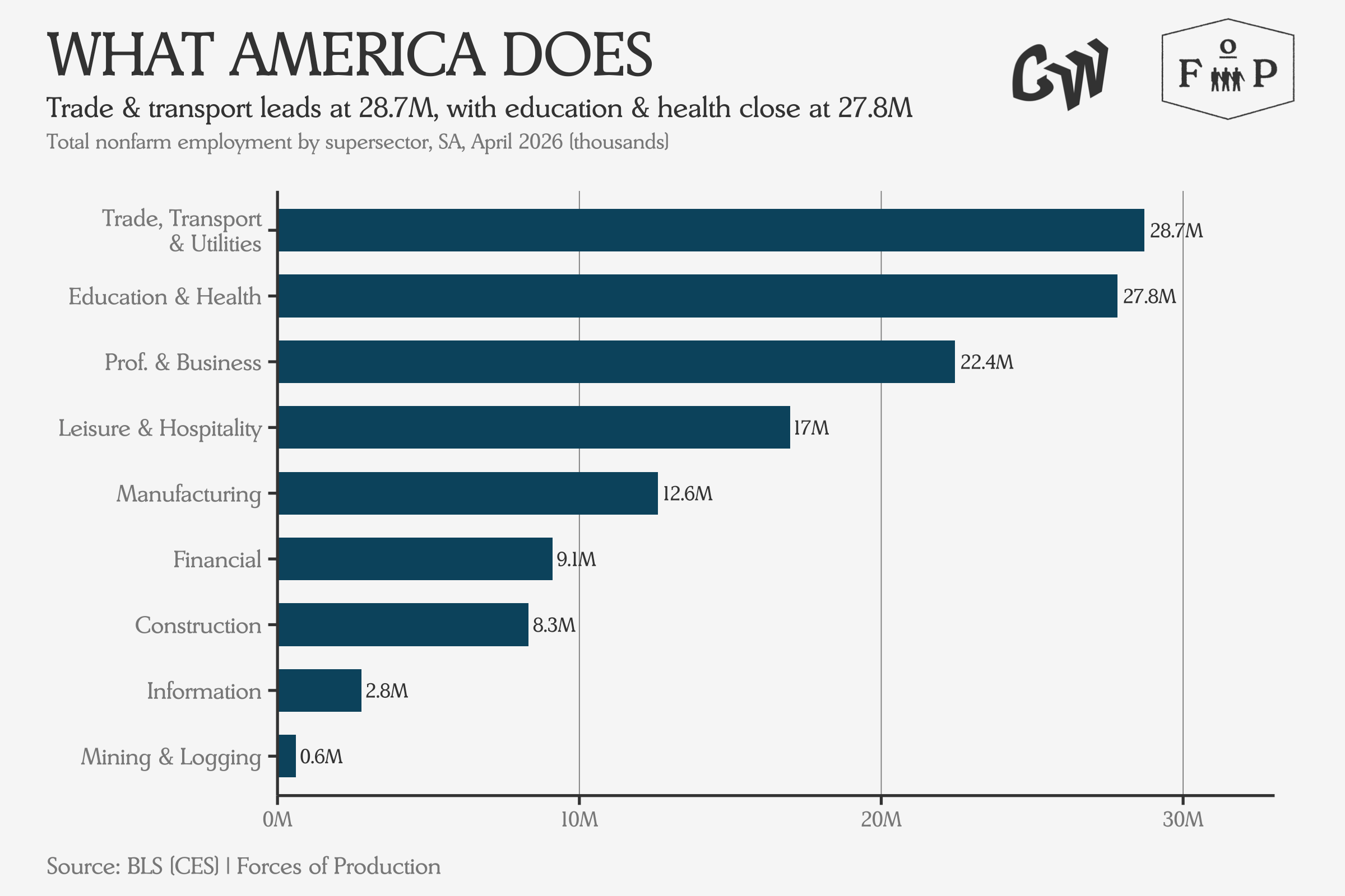
Each bar shows total headcount in a major sector of the economy — and the gap between the service sectors at the top and manufacturing near the bottom tells you how far the structural shift has already gone. Trade and Transport are the biggest, managing how the goods get from where they are made or imported to where they are sold to where consumers purchase them. The biggest growth though, has been in Healthcare, which overtook Manufacturing employment at the beginning of our period, and has more than doubled it by the end to become almost 20 percent of the US workforce nationally.
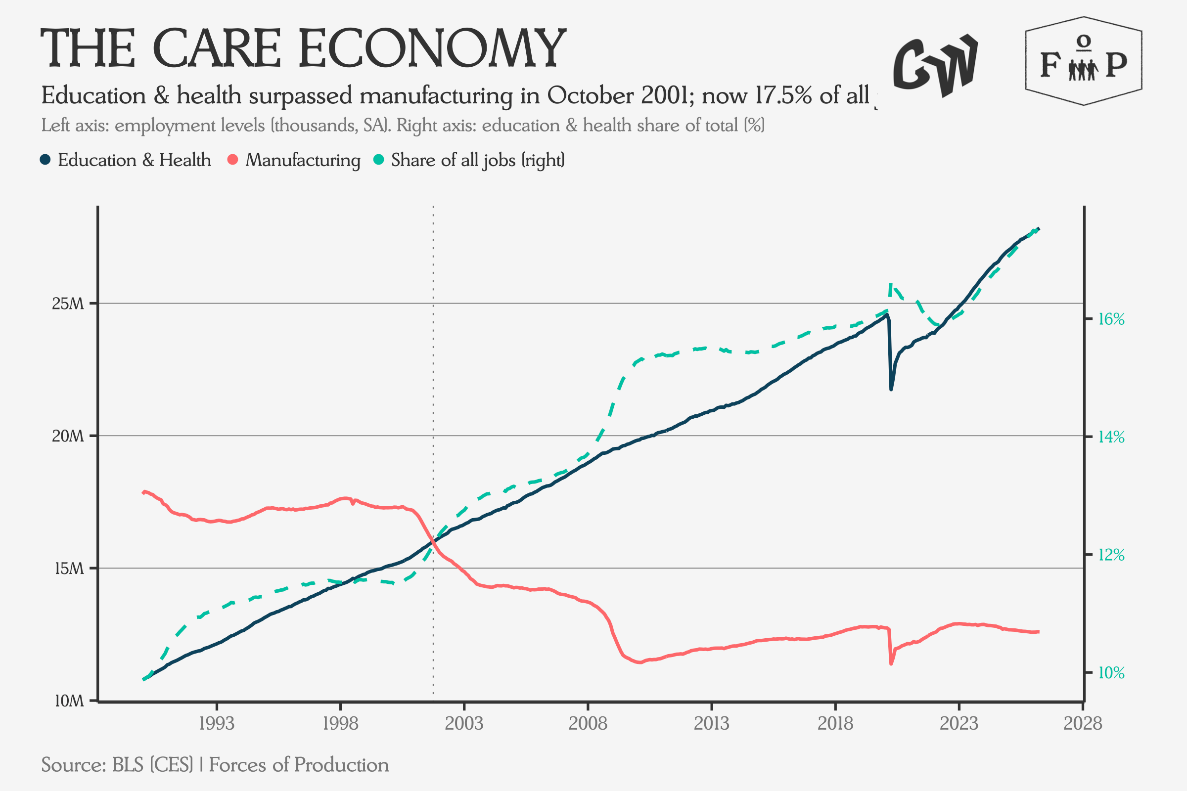
The left axis shows the two lines crossing in 2001, with Education and Health pulling away ever since. The right axis shows what that means as a share of total employment: a steady climb from under ten percent to nearly 18 percent, with no sign of leveling off.
In some states, almost a quarter of working people work in healthcare.
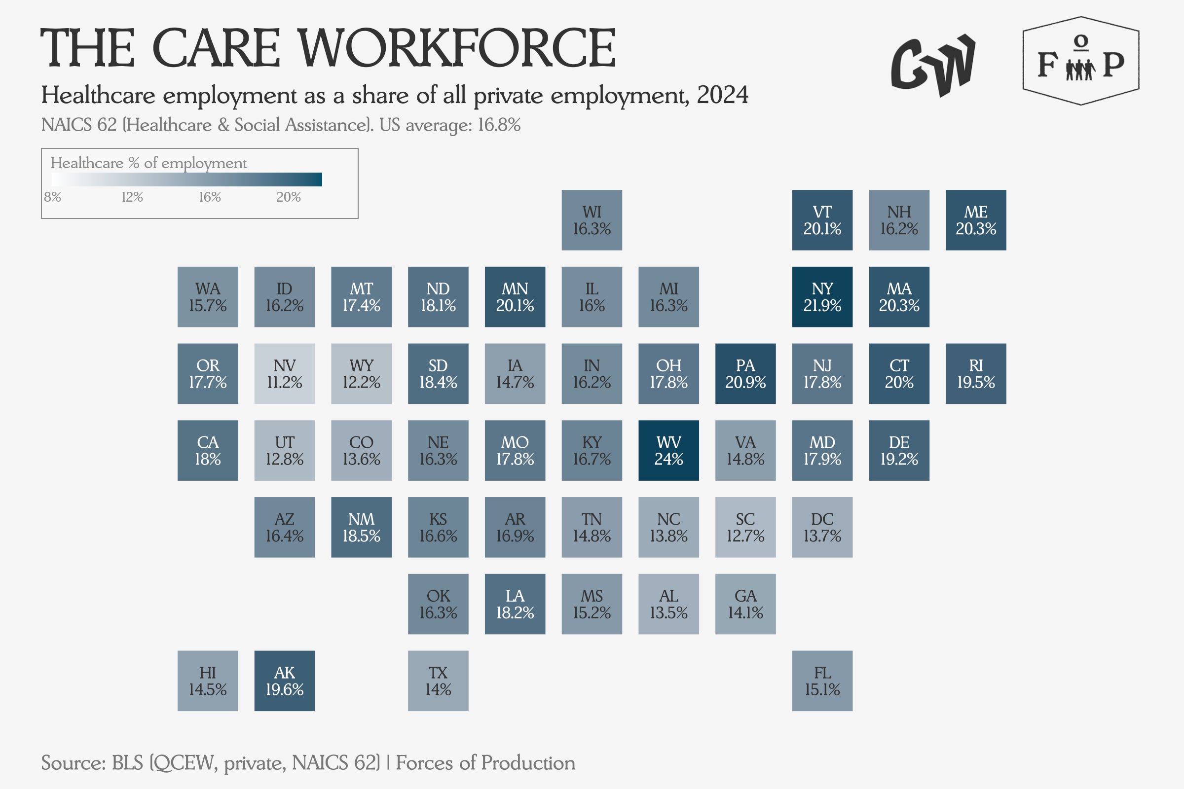
The states where Healthcare is the biggest share of private employment tend to be older and more rural — West Virginia, Maine, Vermont — where other industries have also thinned out.
Healthcare has accounted for as much as 50 percent of net employment growth in some states in the 21st century.
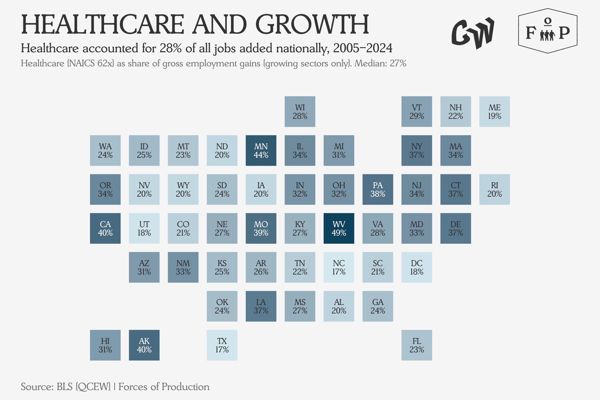
In states shaded darkest, Healthcare accounted for the majority of all net new private-sector jobs — and in a few states like West Virginia and Connecticut where total employment shrank, Healthcare was the only sector still growing.
Yet in recent years, Warehousing has become the fastest-growing employment sector in almost half of states.
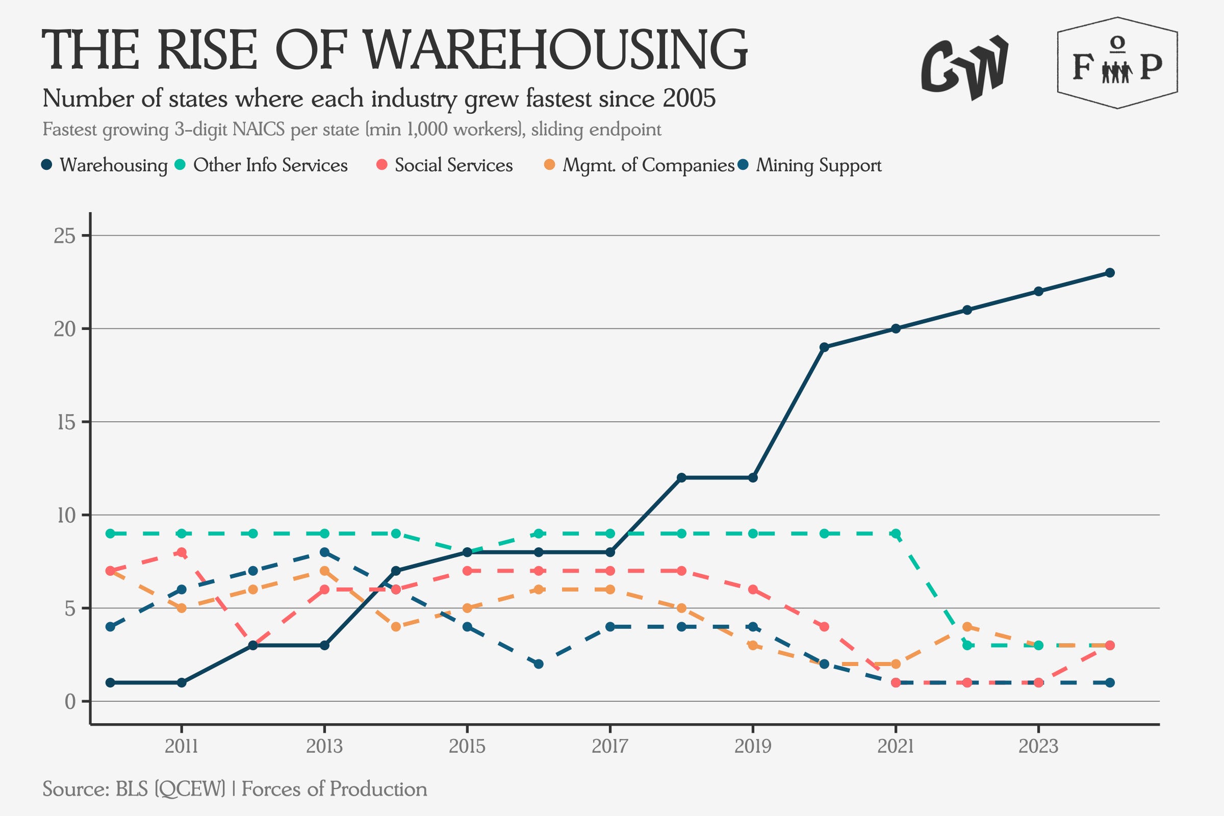
Each line tracks how many states had that industry as their single fastest-growing sector each year — and you can watch Warehousing go from a niche in 2010 to the dominant story by 2024, displacing everything else on the chart.
But let’s get back to the national level. Every state gained jobs over this period, with the biggest gains overwhelmingly in the sunbelt and mountain west states.
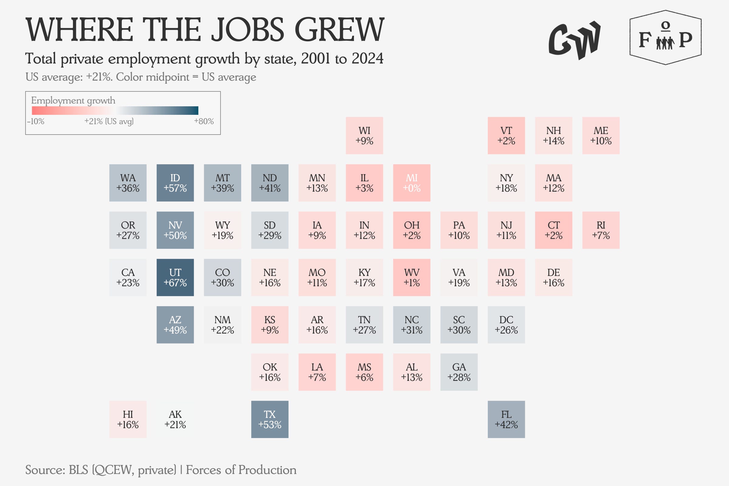
The color scale here is centered on the US average employment growth rate, so a state in coral did not necessarily lose jobs, it just grew more slowly than the country as a whole. Yet looking at the state level hides how geographically concentrated this growth has been, and the politically and economically salient urban-rural divide it has created.
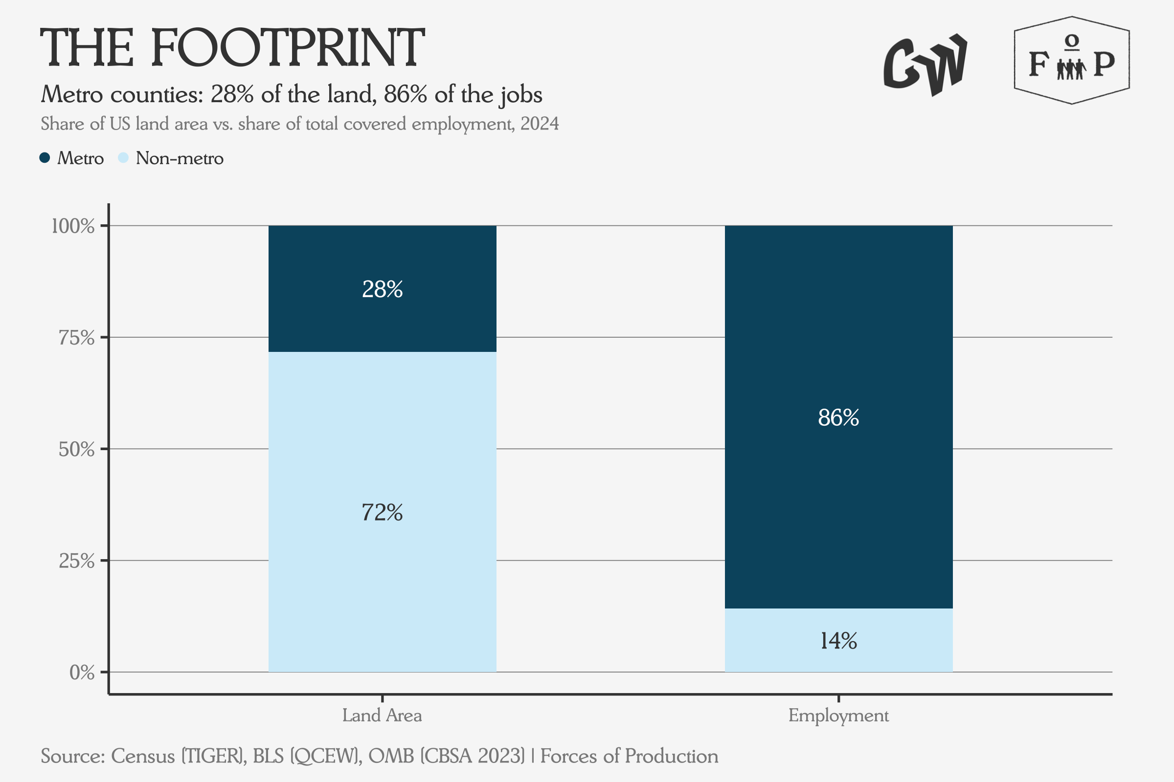
Metro counties, defined as those containing or adjacent to a city of 50,000 or more, cover barely a quarter of the country’s land area but employ more than eight in ten workers.
Again, the economy is mostly people, not land.
As we discussed in last month’s issue, all the employment growth over this period came from the service sector, rather than Manufacturing, which at most reallocated between states.
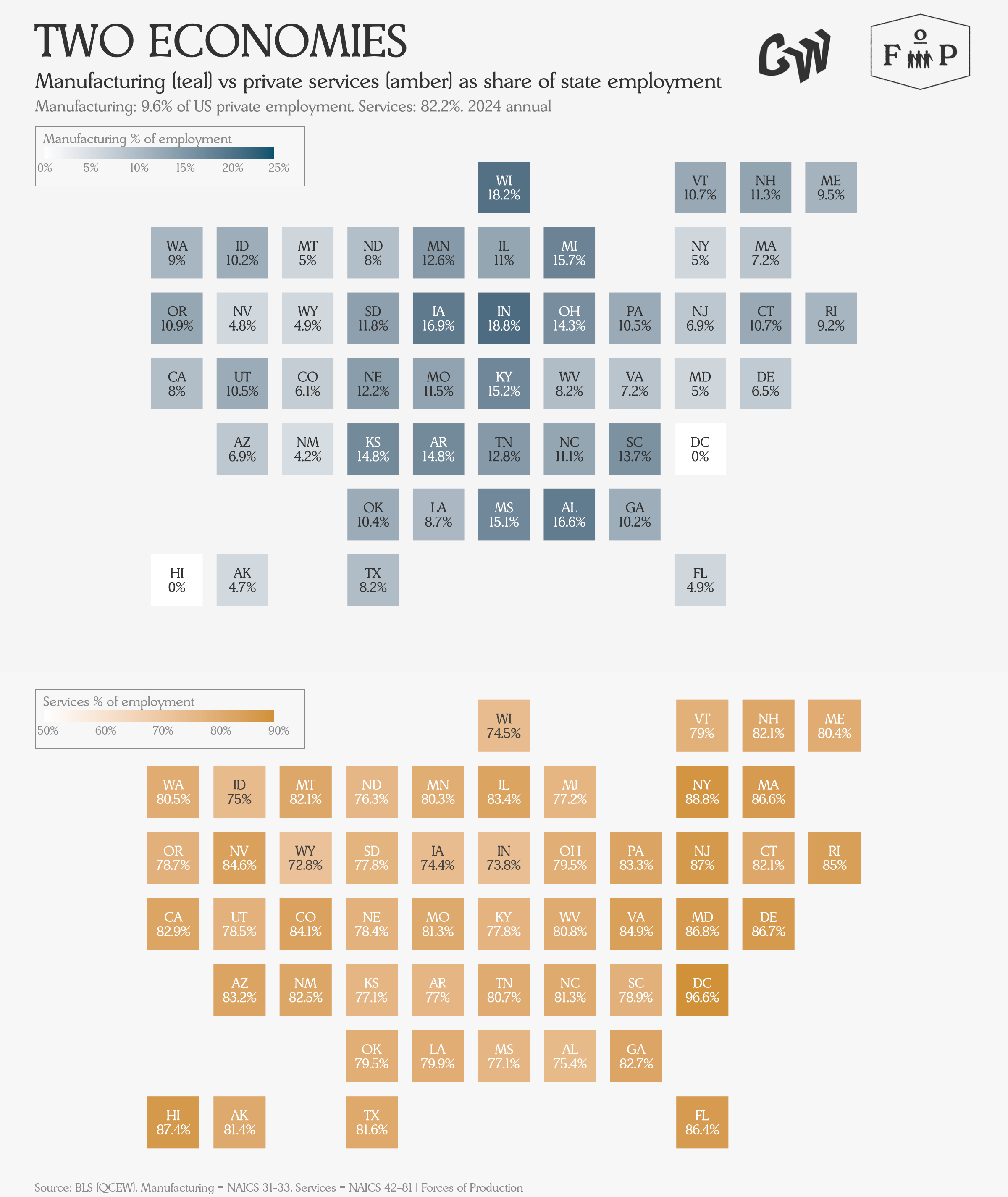
Where Manufacturing’s share is high (darker, top), services tend to be lower (lighter, bottom), and vice versa. Indiana, for example, has one of the highest manufacturing shares and one of the lowest service shares.
Yet we saw growth in both high-wage and low-wage sectors. In fact, the balance of growth between these two varies significantly by state, with some states adding primarily high or low-wage services, with others adding a balanced mix.
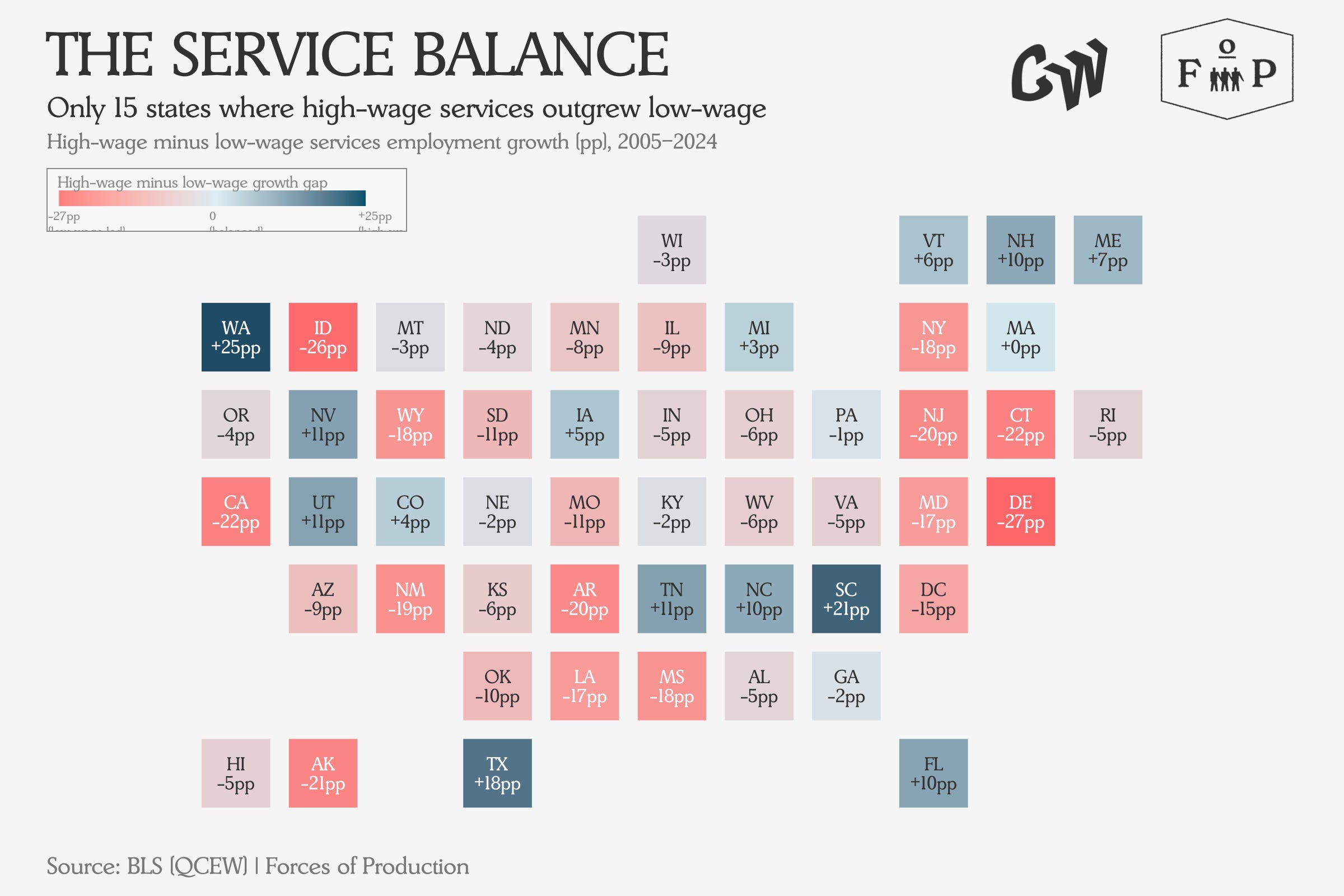
A positive number (teal) means that state added proportionally more jobs in sectors like tech, finance and professional services; a negative number (coral) means the growth tilted toward retail, food service, warehousing, and other lower-paying work.
Before we move on to questions of investment, we do have to stop for one fun chart that shows something quirky about each state, and what jobs people have there.
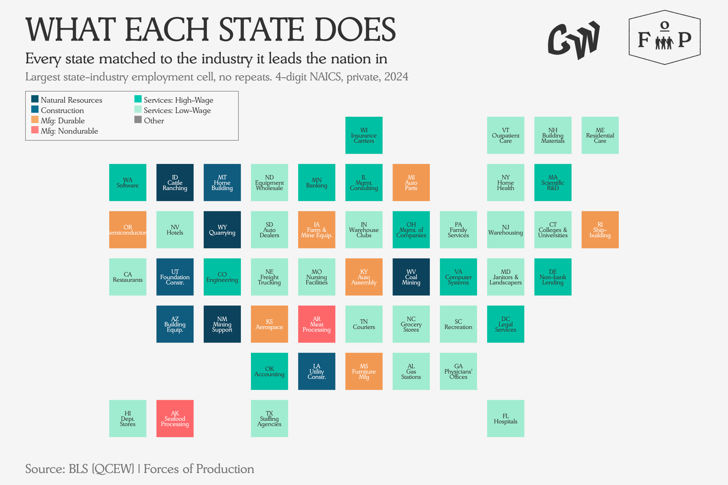
Each state is colored by the broad type of industry it leads in — teal for Natural resources, orange for Durable Manufacturing, coral for Nondurable Manufacturing, and shades of green for Services — so you can see the economic geography at a glance.
I think the funniest for me is “Non-bank Lending” in Delaware, home of the credit card companies, but please sound off in the comments with your favorites.
Investment
So, the economy is people, and those people work at jobs, but what about the equipment they use at those jobs? To make output, labor still needs to make use of buildings and equipment. The question now is which equipment? And where?
Investment and capital geography are tricky to explain. This is partly for theory reasons — the fact that capital goods cannot be defensibly aggregated into dollar values animated one of the biggest scandals of 20th century economics (and does, despite our measurements here, remain substantially unresolved) — and partly for the practical reason that the US government does not report many statistics about them.
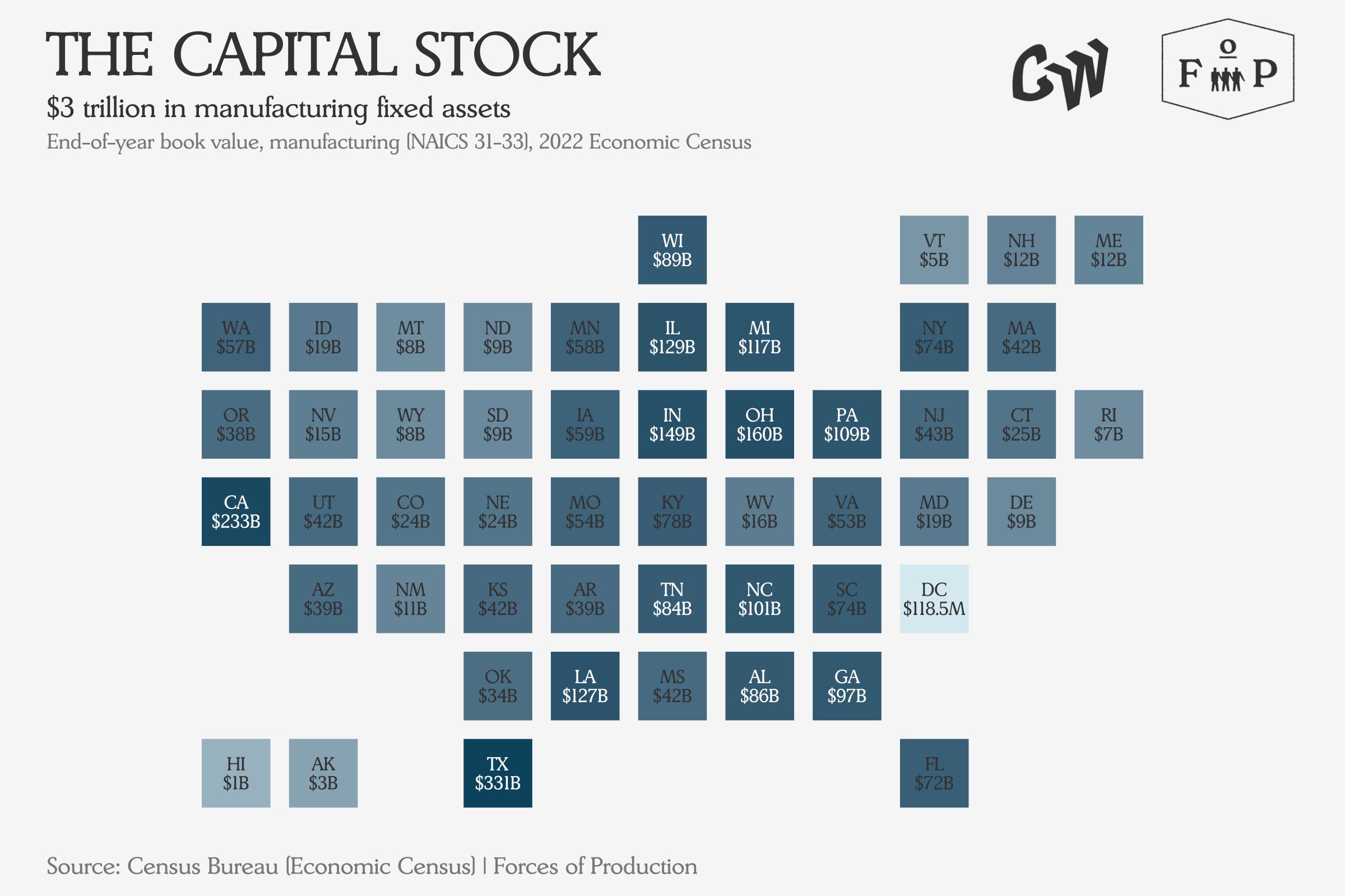
At the state level, our best bet for looking at investment or the capital stock comes from the Economic Census, conducted once every half-decade. These figures are book values — what manufacturers originally paid for their buildings and equipment, minus depreciation — so they understate replacement cost, but they are the best state-level measure of installed productive capacity that the government publishes. They only report for manufacturing industries, so the most we have is a measurement of the capital stock in 2022, and the pattern of investment spending by state in 2022.
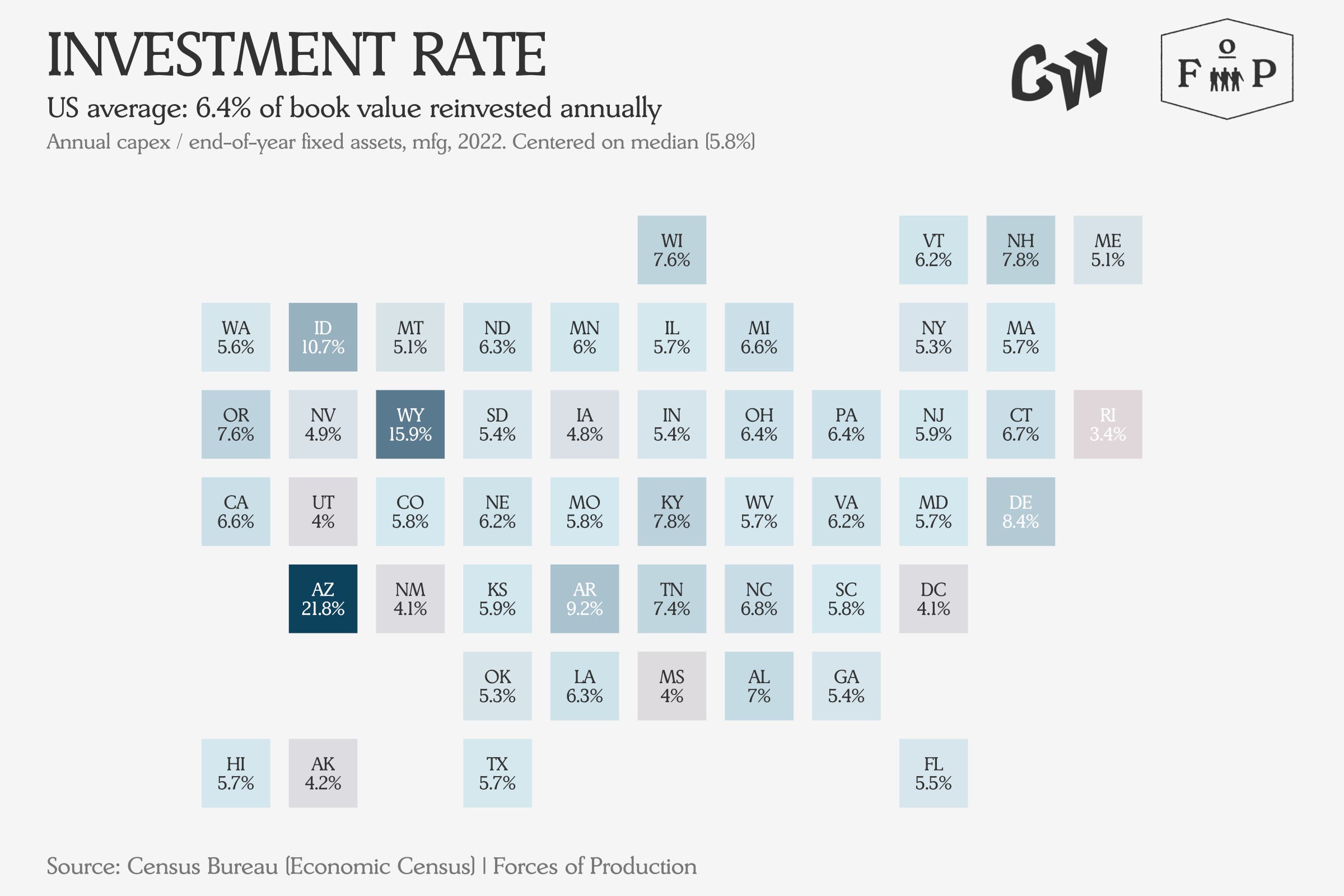
The investment rate tells you what fraction of the existing capital stock each state is adding to or replacing in a single year — a higher number means more active building, while a lower number suggests manufacturers are mostly maintaining what they already have.
Arizona was an outlier in 2022, with massive semiconductor fabs then under construction in the area. Otherwise, investment rates remain broadly consistent across states.
What is more interesting is the direction these states are investing in — which manufacturing industries were spending the most in each state to build new capital as of 2022.
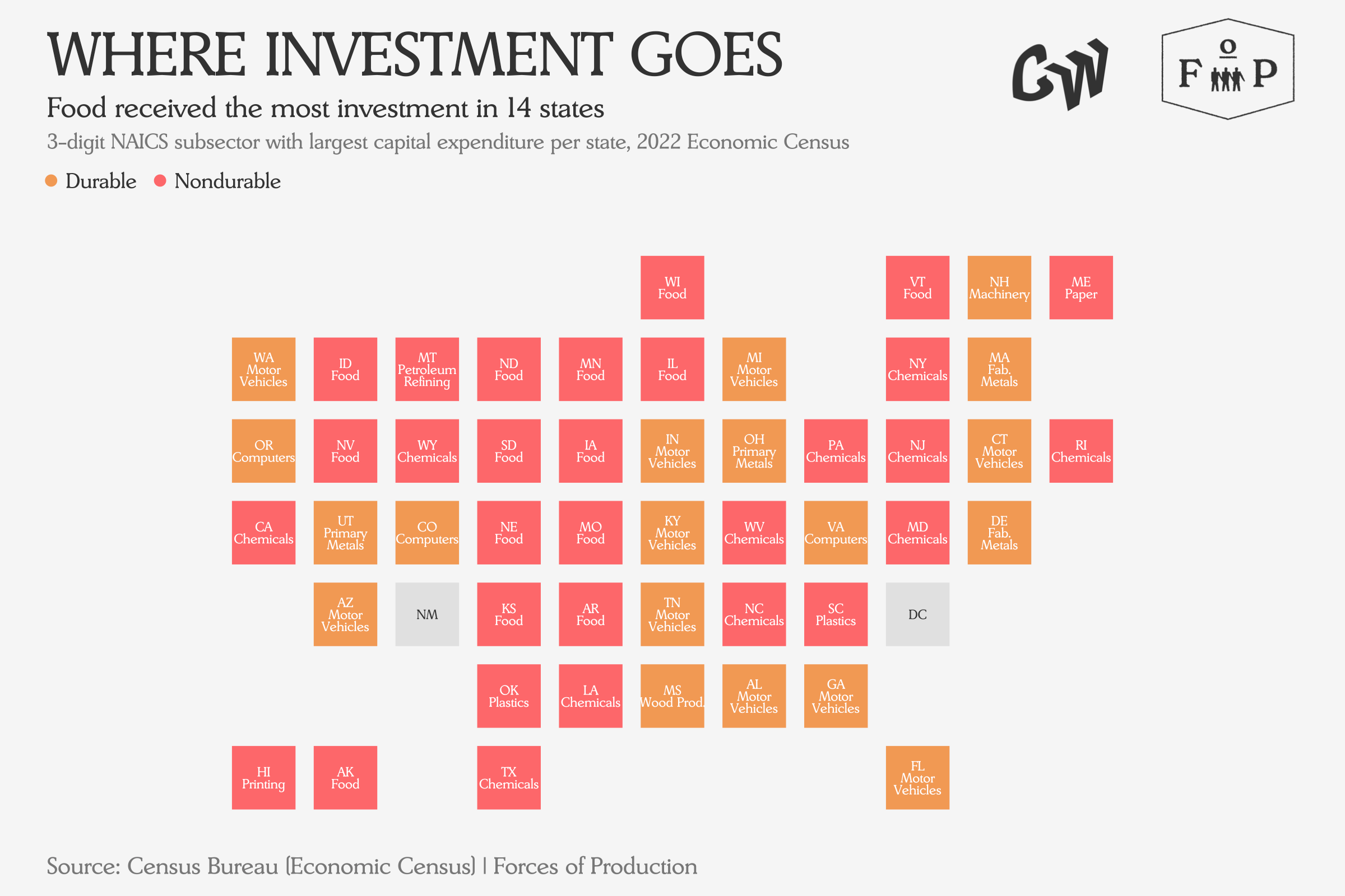
Food manufacturing (coral) leads in 14 states, reflecting the fact that food processing plants tend to be located near agricultural supply rather than near population centers — so states like Wisconsin, Iowa and Arkansas show up prominently.
Fiscal
The government is already a massive participant in the economy, and a participant at different scales in different state economies. Transfer payments account for 20.4 percent of national income, and non-transfer government spending accounts for a further 10.8 percent of annual GDP.
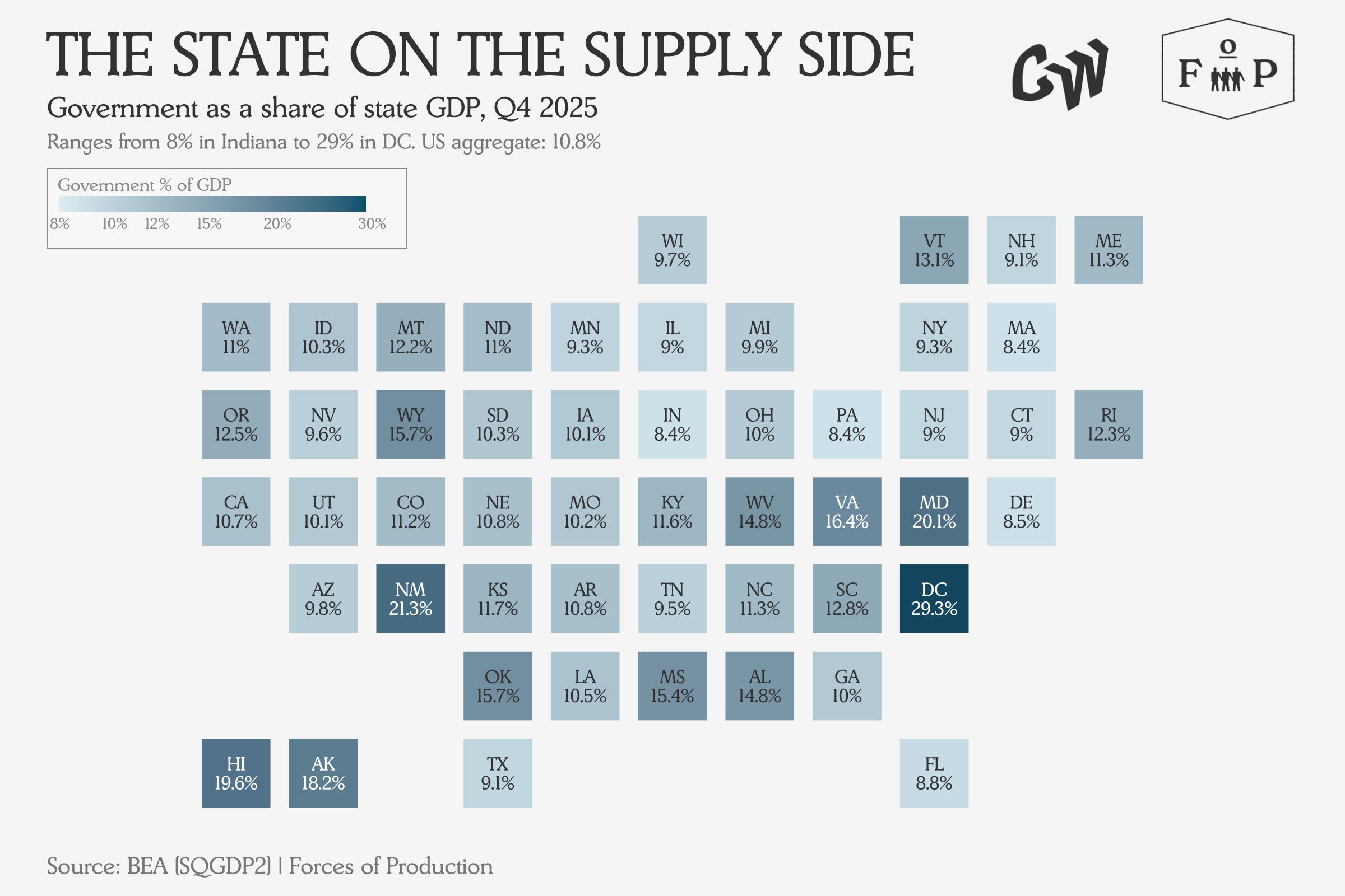
Government here includes federal, state, and local spending that shows up in GDP — military bases, public universities, state agencies — but does not include transfer payments like Social Security or Medicare, which flow directly to individuals.
The government share is bigger in some places than others, but it is declining almost everywhere:
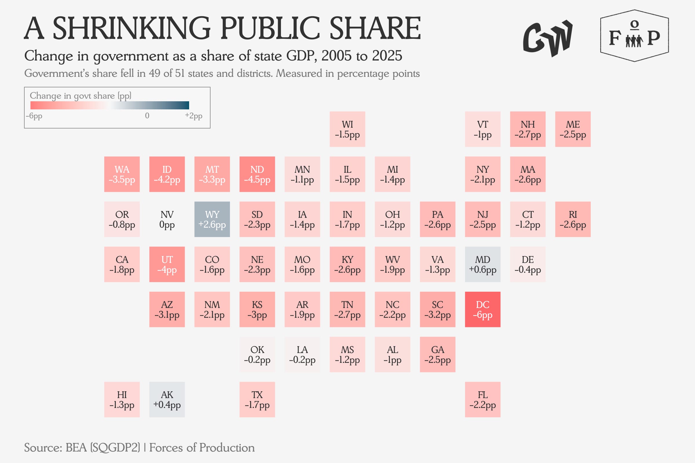
The decline has been nearly universal even as the services the government funds — healthcare, education, infrastructure — continued to grow in demand.
Meanwhile, transfer payments have continued to expand, making up 20.4 percent of national income and almost 40 percent of income in some states, with Medicare and Medicaid included.
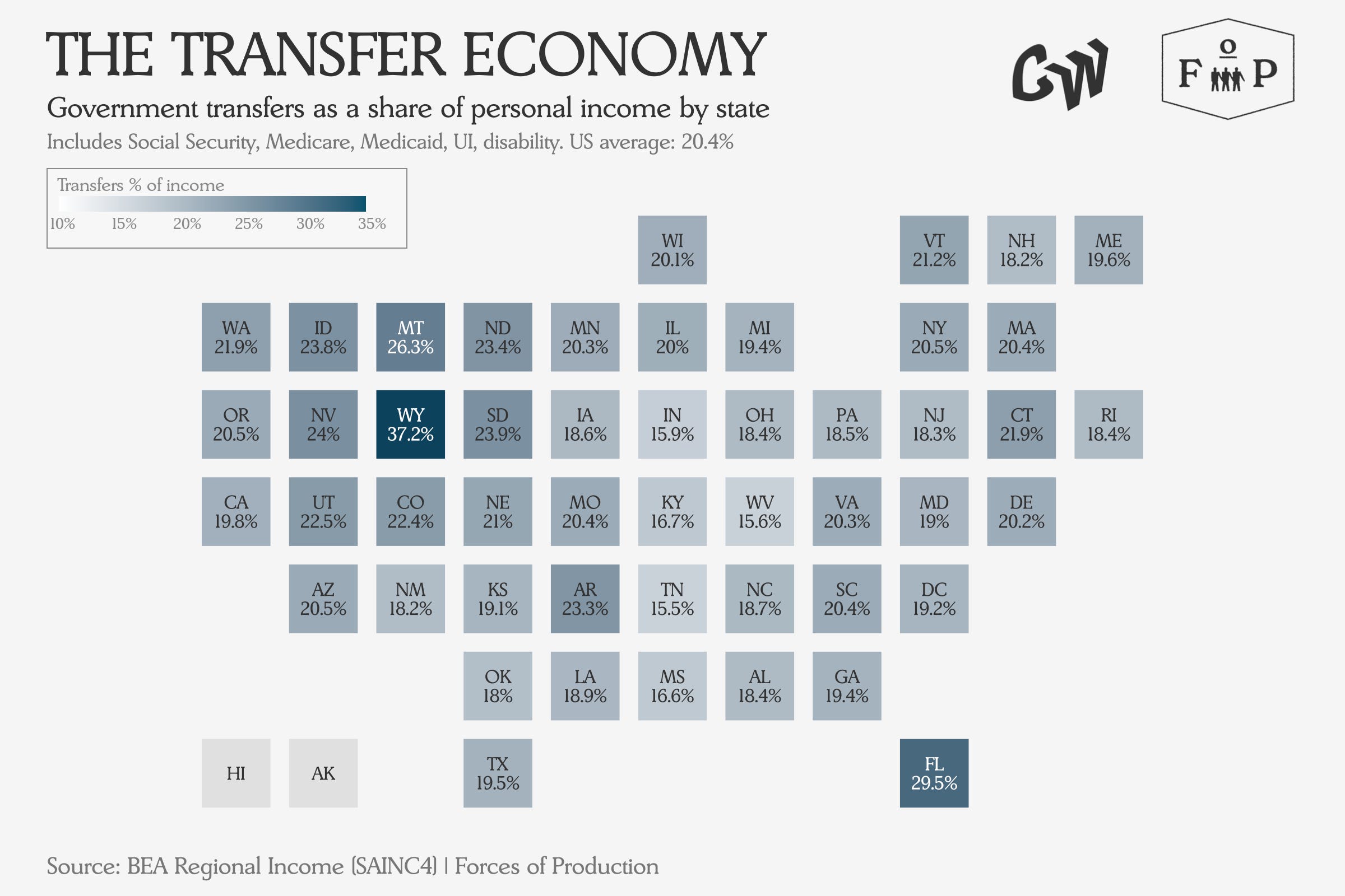
Transfer payments include Social Security, Medicare, Medicaid, disability insurance and veterans’ benefits — money the government sends directly to individuals rather than spending on its own operations. In states like Wyoming and Florida, these flows now make up nearly a third of all personal income.
While healthcare is growing everywhere as a private industry and employer, so are the transfer payments to support it across all levels of government. A key question for the US economy in the 21st century will be to ask: is this really an efficient way to coordinate the provision of healthcare?
This Month’s Data
Here we are looking at the April data, released over the course of May, with the exception of trade which is released on a two-month lag, so we are looking at the March trade data. This feels a bit like a lookback given the speed of the news lately, but enough of the economy has continued along existing trends despite the closure of the Strait of Hormuz that there is a sense the economy is almost on autopilot until the constraints really bite.
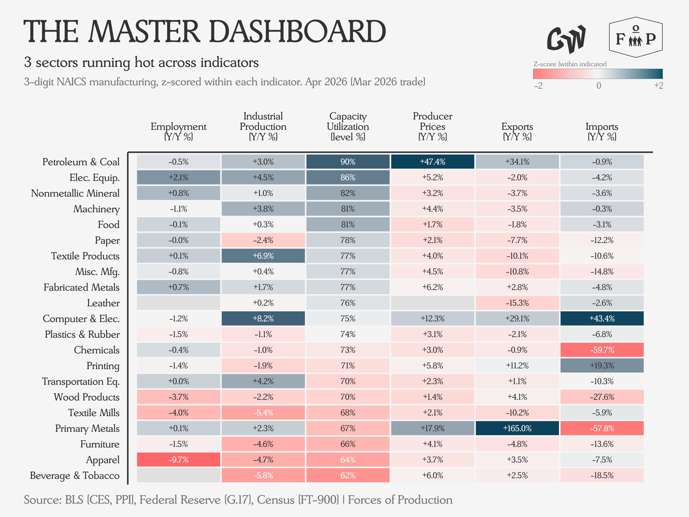
In this table, we see the main stories of this month’s data.
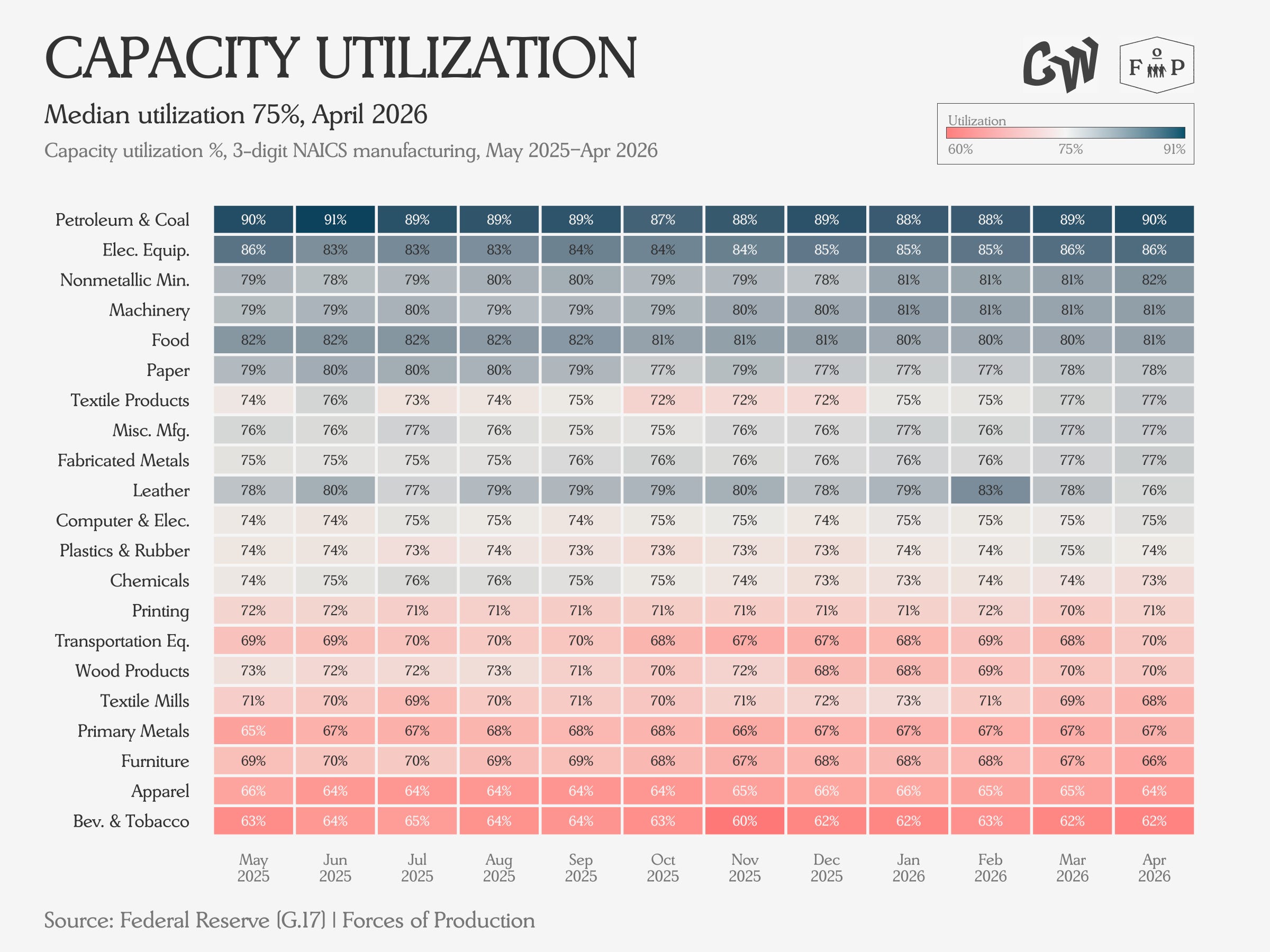
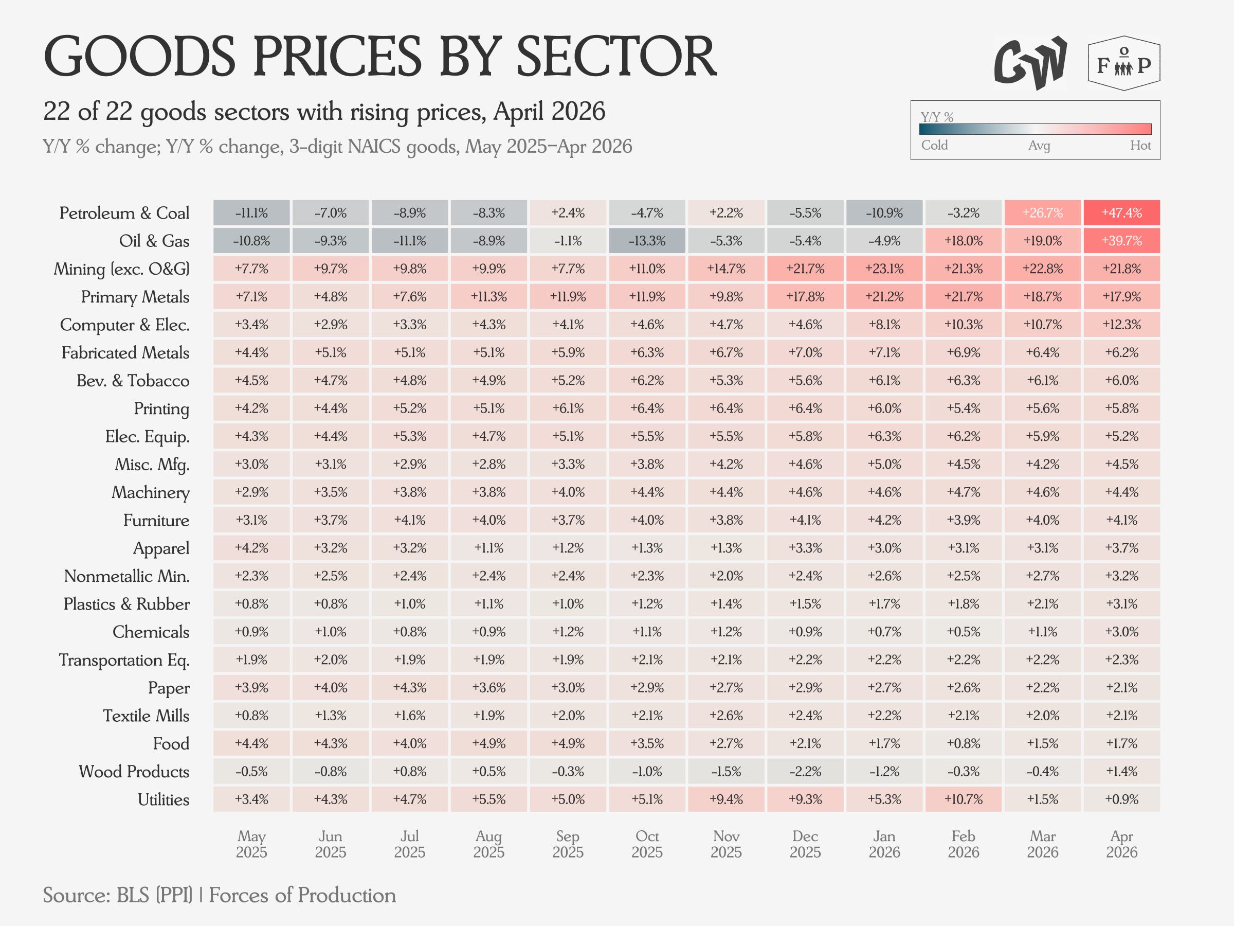
Petroleum and Coal Products is running flat out in capacity terms alongside growing output and export volumes while prices go essentially vertical. This is a textbook response to an external supply shock like Hormuz — producers are working overtime in pursuit of global demand.
In the time since this data was released, the success of temporary management measures (reserve releases and demand throttling among them) as well as public jawboning have brought spot and futures prices for oil and refined products down some since April, but this will move back up as solutions prove increasingly unrelated to the real problem of the supply of molecules. The value of exports will likely continue to track changes in price.
Electrical equipment continues to add employees and expand output while holding price pressures relatively contained despite high-capacity utilization and a changing trade picture. All over the world, electrical equipment supply chains are being stressed by the shift towards electrification and the needs of new generation capacity.
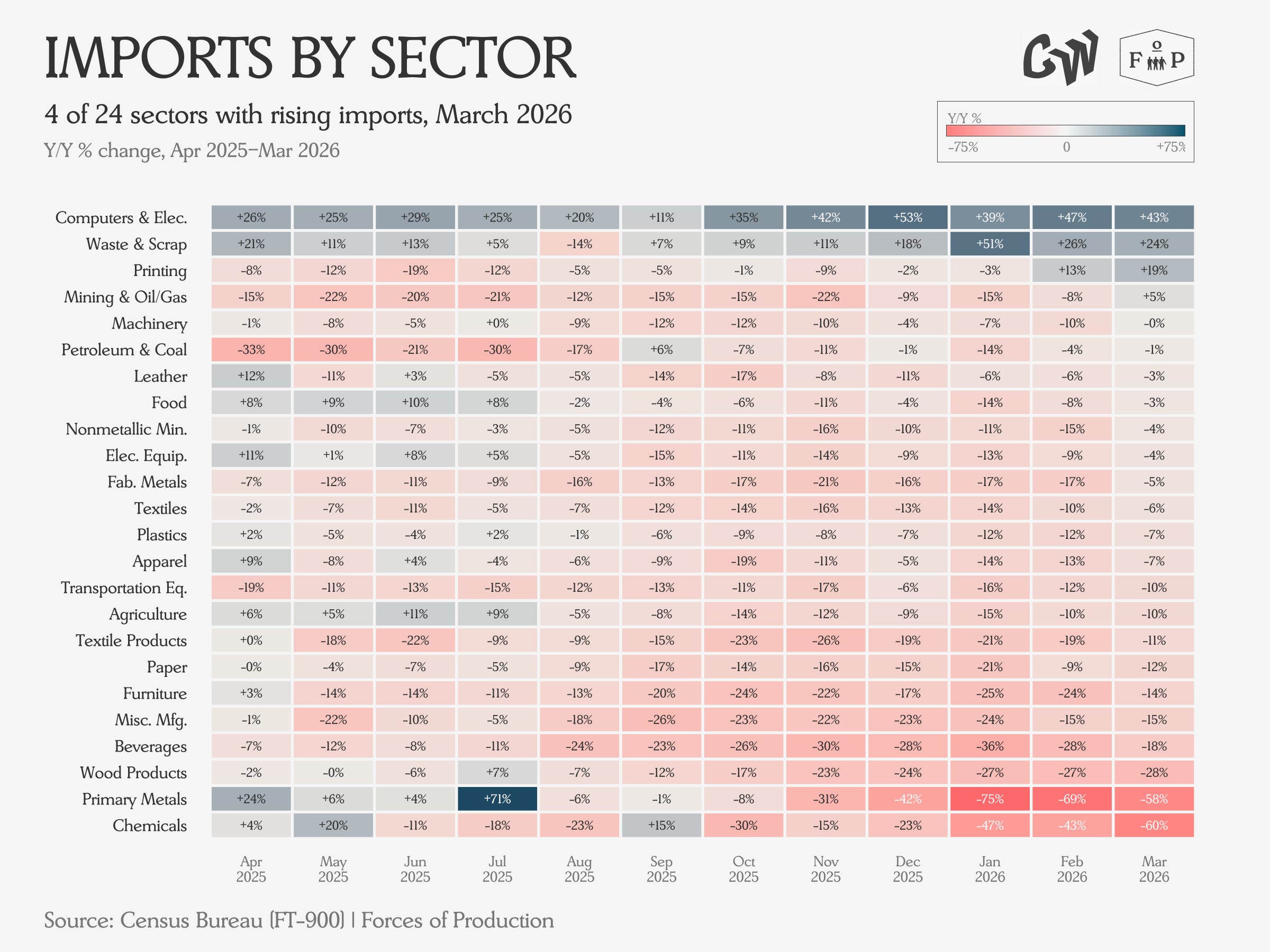
Computers and electronic products are seeing growing production while continuing to shed jobs against rising prices. The value of imports and exports both continue to rise on rising prices and volumes. As the data center buildout continues to expand, demand pressure for chips is likely to remain tight for businesses and consumers alike.
In the data for next month’s release, we will expect to see some moderation in petroleum price growth representing the easing in May, but for other trends to largely continue as before, with a continued sense of autopilot.
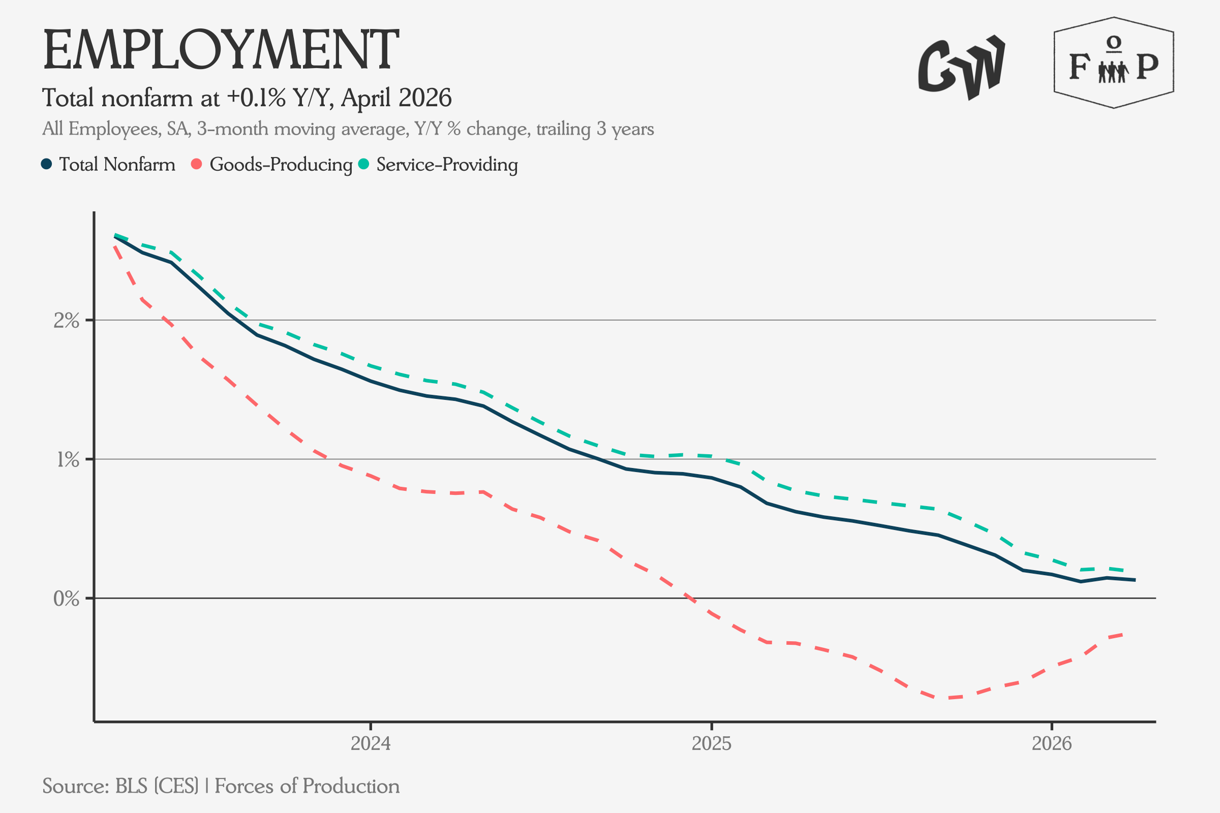
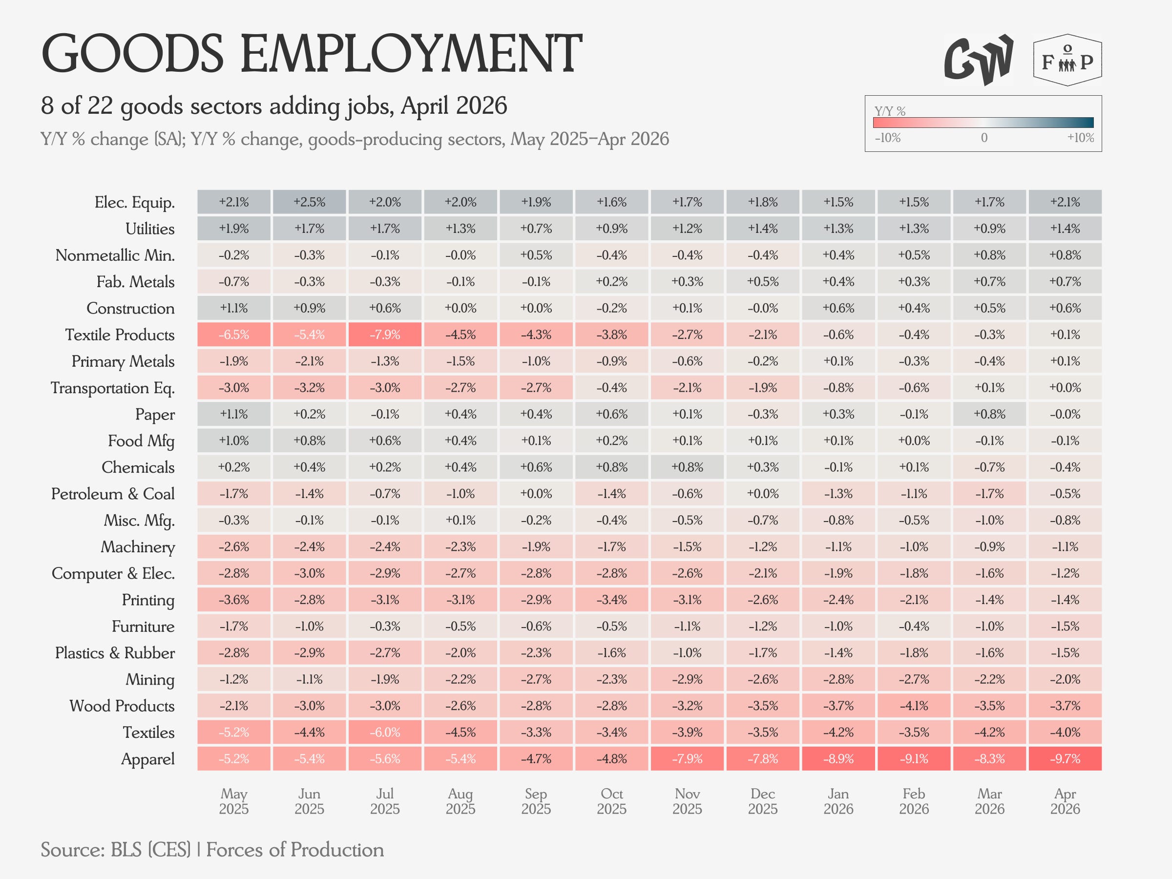
Employment
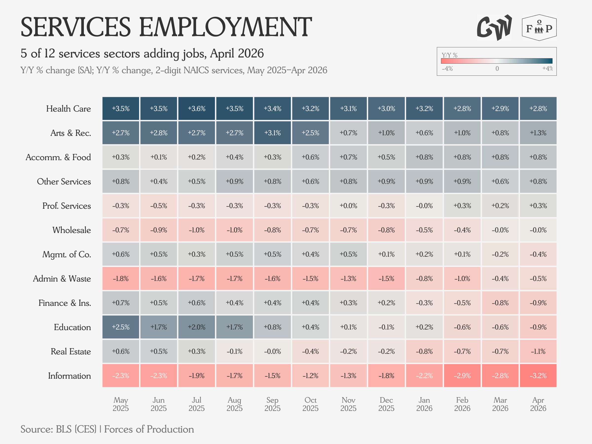
Overall employment posted weak and slowing growth year over year, with Goods employment slowing its slide. Services employment growth continues to dominate.
On the service side, the fastest growing sector — Healthcare — has seen a deceleration in job adds, downshifting from 3.6 percent year over year growth nine months ago to 2.8 percent in April’s numbers. The information sector extended its employment decline as well, accelerating from a 1.2 percent year on year decline six months ago to 3.2 percent in April.
Electrical equipment continues to post the strongest employment growth on the goods side — 2.1 percent year on year growth is close to the healthcare sector’s 2.8 percent, albeit on a smaller base — while the Textiles and Apparel complex posts the biggest losses.
Industrial Production and Capacity
Growth in durable goods output has kept total industrial production growing for the past year, and the trend continues in April’s data.
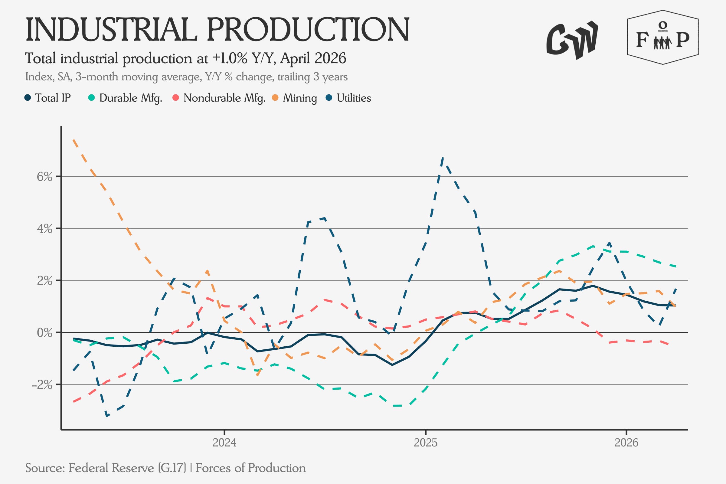
The main stories here are that growth in Durables output, which is coming from Computers and Electronics, Transportation Equipment and Machinery, which we see in the top right of the heatmap.
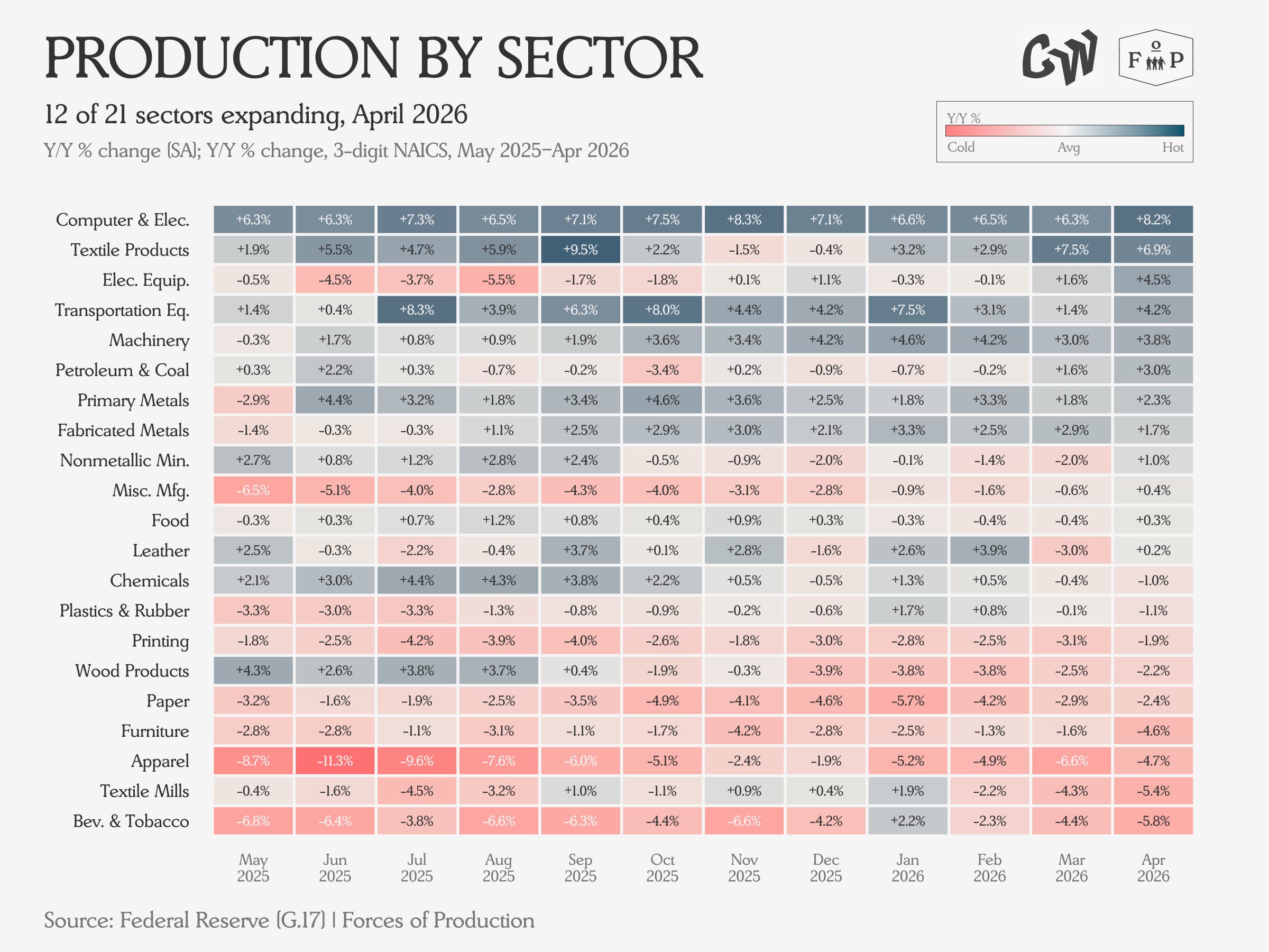
We see wide dispersion in capacity utilization but also that refineries have come into the Hormuz shock running close to maximum capacity already.
Prices
Producer prices ticked up significantly in the April data, pulled upward by substantial increases across the entire mining-and-refining complex, for both oil and gas to refined products as well as other mining to primary metals production.
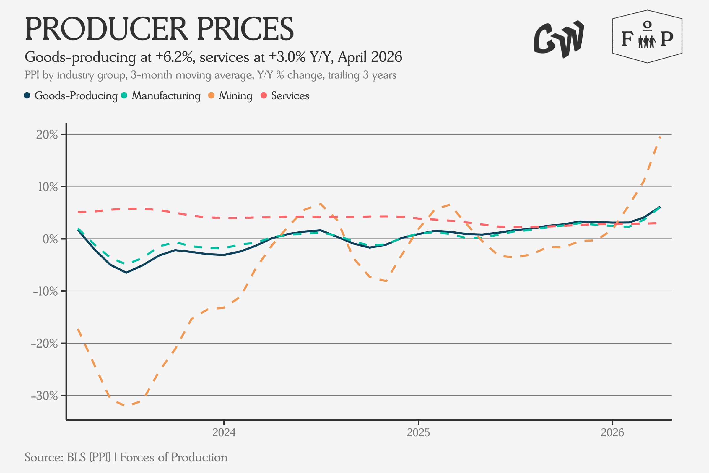
On the Goods side, we see prices rising around 4 percent year over year for the median sector.
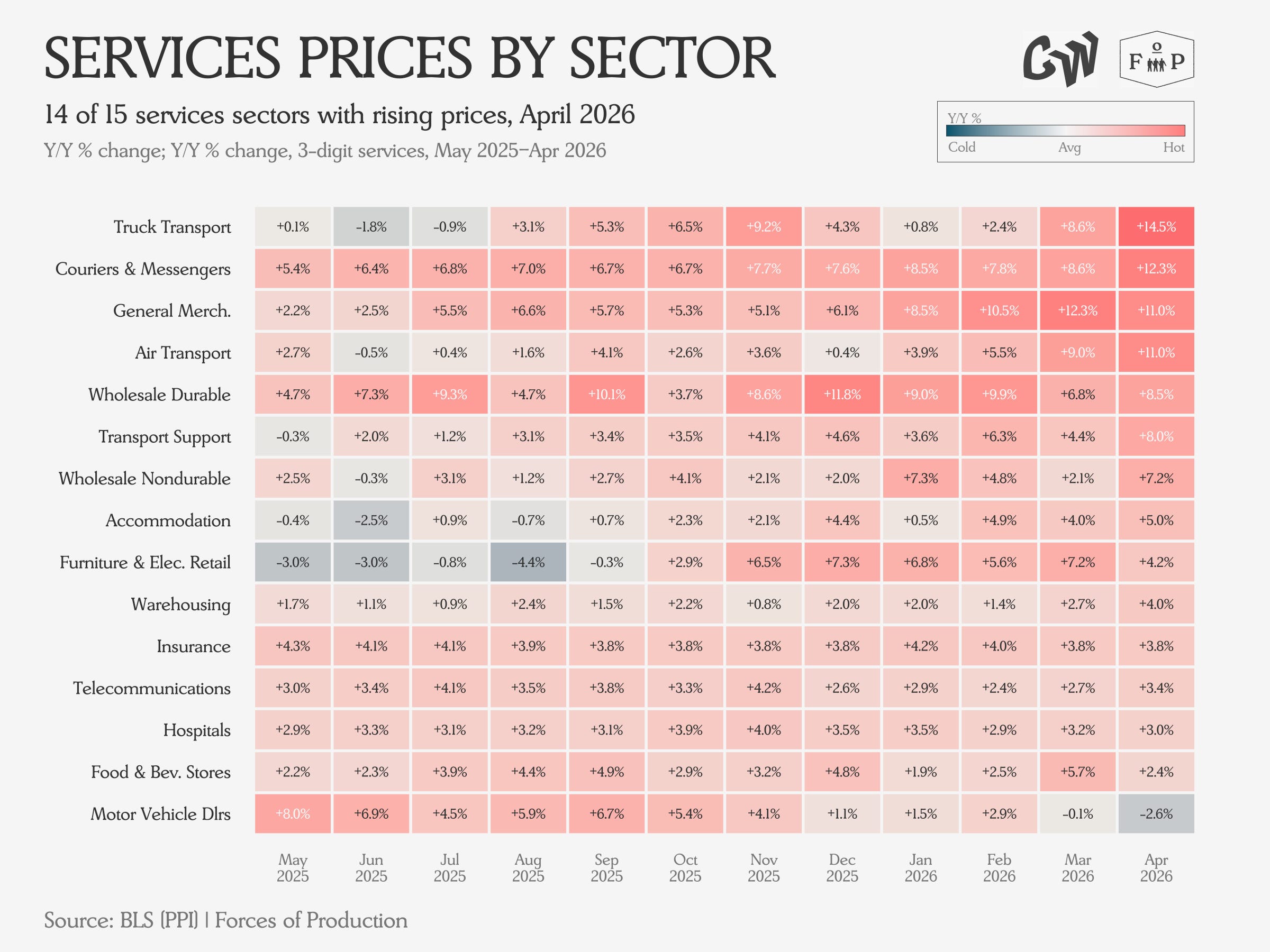
The Services side shows stronger inflation, with Truck Transport prices up nearly 15 percent year over year in the April data (as an aside, in last year’s April data this number was essentially zero). Air Travel, Couriers, Transport Support, and other sectors exposed to the coming price shock in refined petroleum products all showed significant price acceleration in the April data, with more to come as the impact spreads across the full production network and firms react.
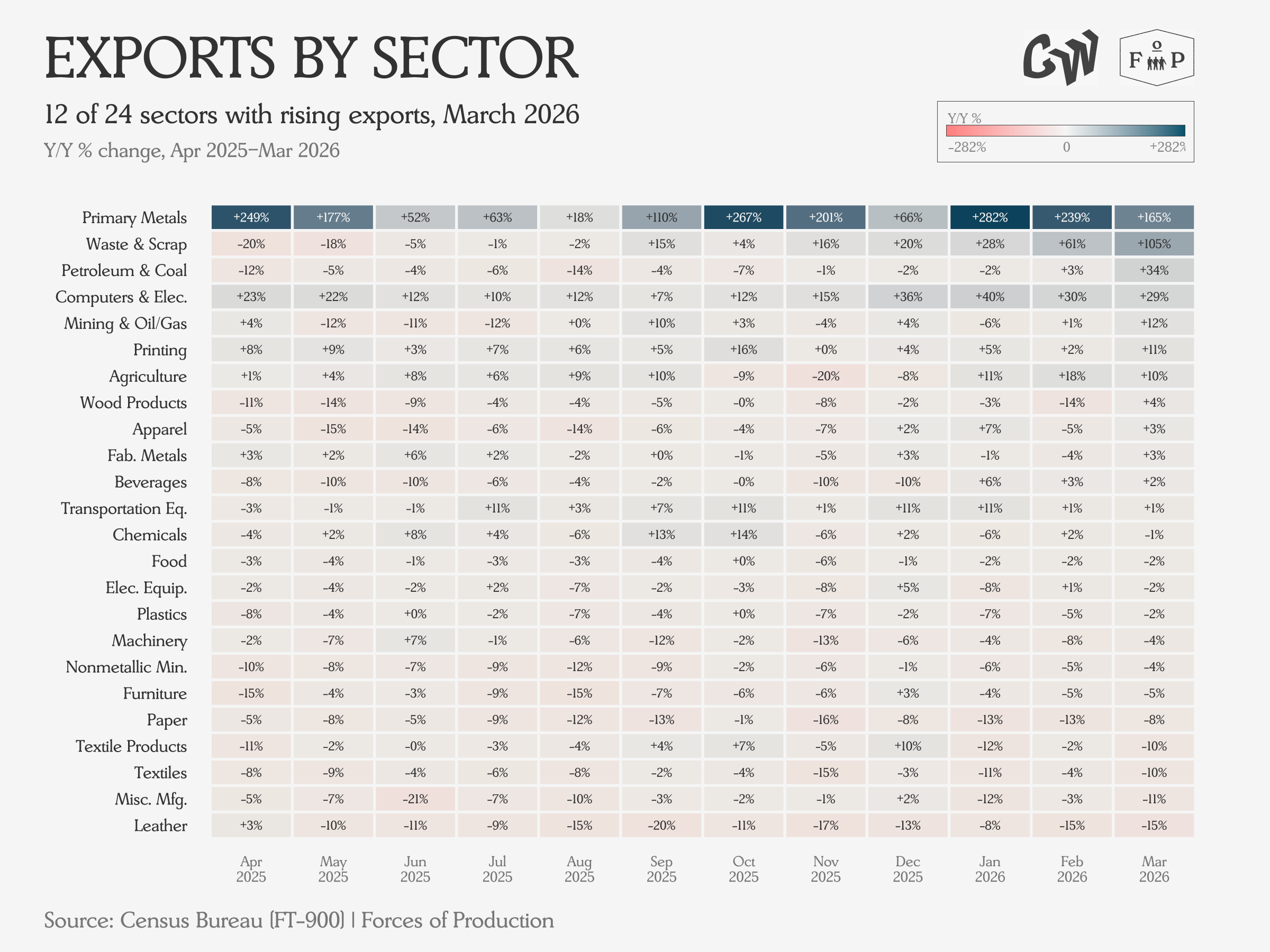
Trade
The trade deficit continues to fall on both falling imports and rising exports for 2026. The March trade data is no exception.
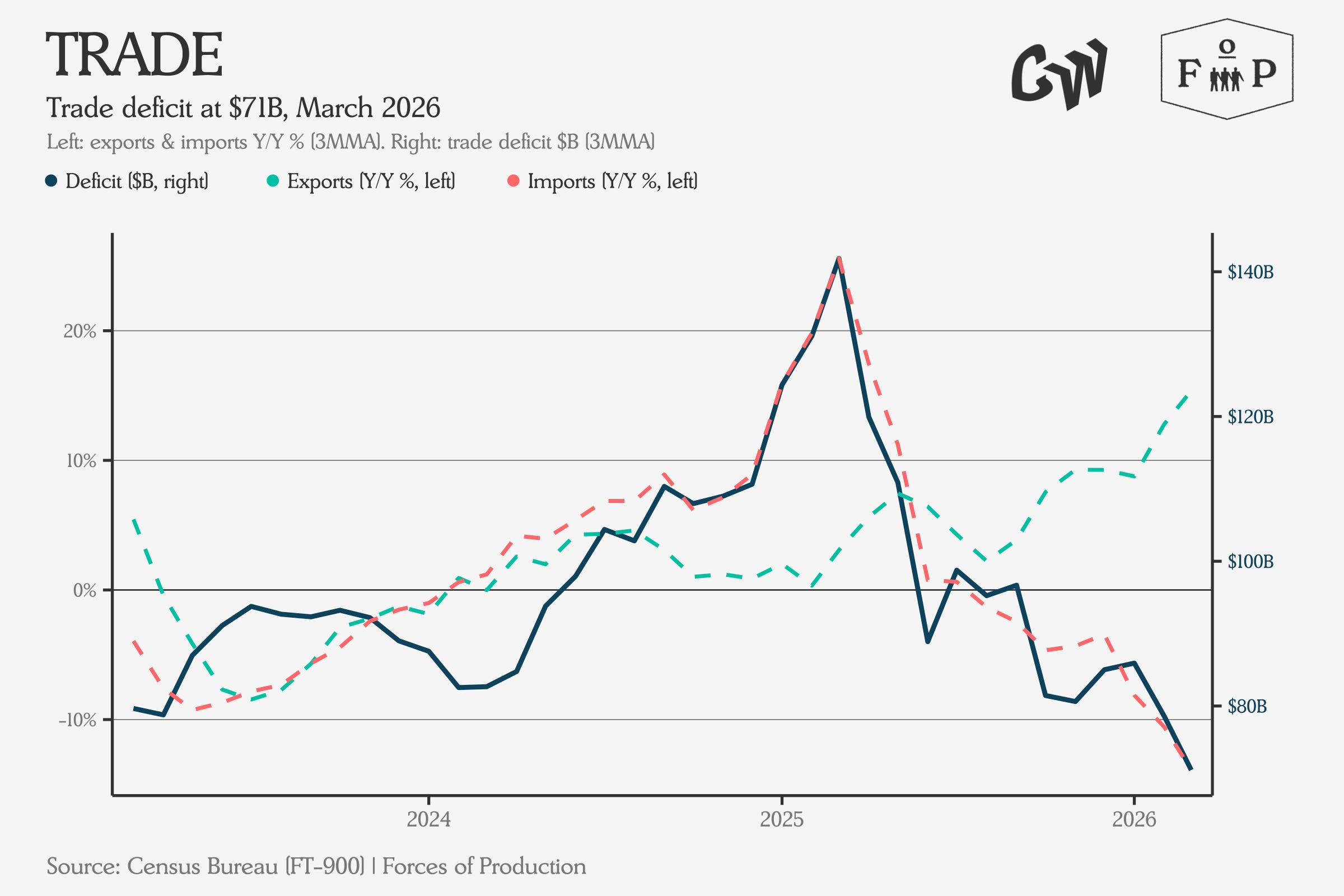
Outside of Computers and Electronic Products, import values are broadly falling.
Exports are more mixed, with half of industries posting falling Export values and half rising. The biggest increases have been in Primary Metals by far, but Computers and Electronics have shown remarkable acceleration over the first quarter.
How It All Adds Up
Overall, the feeling continues to be one of an economy on autopilot in an accelerating news cycle, with real shocks coming down the line. The second Trump administration has taken a series of swings at the foundations of economic growth — tariffs that raise input costs for domestic manufacturers, immigration enforcement that tightens an already constrained labor supply, the closure of the Strait of Hormuz sending energy prices vertical, and cuts to university funding that threaten the pipeline of both science and services spending in American towns.
Each one of these will have real impacts on the productive economy, but we can’t see most of them in the data yet. The economy does not turn on a dime. Policy changes take months or years to work their way through supply chains, hiring decisions, and investment plans.
In the meantime, the economy is being carried forward on its preexisting trajectories by sheer inertia. What we can see in the April numbers is exactly that momentum — the same sectors growing, the same sectors shrinking, and the same patterns we have been tracking for months continuing largely unchanged. The question is not whether these shocks will show up — it is when, and whether we will have done anything to prepare for them by the time they do.
We do see some evidence of the Hormuz shock, both in its immediate impact on the sectors with direct involvement — petroleum and refining — as well as the beginning of what is likely to be at least a year of pricing upswing among industries that remain major users of refined petroleum products.
So far, in the April data, everyone seems to be counting on a return to normal for oil markets without lasting long-term damage to global refinery infrastructure. How likely that outcome actually is, is anybody’s guess, but if things keep going the way they have been, we will certainly see prices go up.