

Services on the Supply Side
Looking away from Manufacturing for a moment

Instead of looking towards the future (of the inflation impacts of energy shocks), today we will be surveying the past. Since this newsletter promises a public view of the US supply side, it is worth taking an issue to explain that vastly more of the supply side consists of the provision of services than it does of the production of goods.
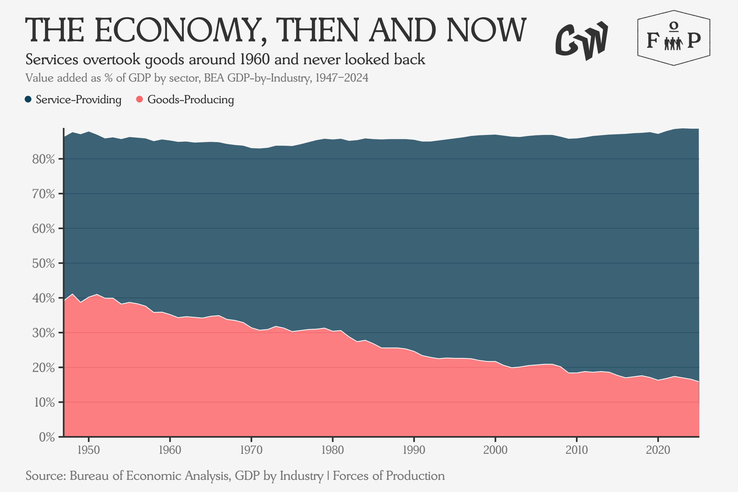
No matter how many times the story of the shift to services is told, this is still a striking chart. In a way, it is just a continuation of a longer shift out of agriculture, which begins at about 10 percent of GDP in 1947 and falls to 1 percent by 2024. But really by 1947, most of the historical shift out of agriculture had already finished, meaning modern economic statistics only show its last moments.
So, what stands out about this story now?
Maybe most striking today is the fact that, despite this shift, policymakers and commentators still seem to see the supply side as mainly a place where goods are shipped out of factories (ideally for export), and only sometimes a place where skilled practitioners add value by performing services. For example, Biden-era industrial policy focused primarily on manufacturing, and yet counterproposals to it bid to go even further in the direction of “techno-industrial policy”.
Now, this is not to say that manufacturing doesn’t matter. A strong manufacturing sector is critical for developing and maintaining the kind of economic complexity that ensures resilience and drives growth. Manufacturing participates directly in the processes of technological innovation: if a new advancement cannot be manufactured as a product, its full potential is unlikely to be realized. While manufacturing is critical — not least for providing the necessary substrate for high-value services — an industrial policy that only addresses the 20 percent of GDP involved in the production of goods will encounter significant limitations.
Against the background of this limited industrial policy, a growing chorus of commentators has started to notice something significant is happening with services — especially healthcare — as a force unexpectedly reshaping the supply side.
Conor Sen, writing in Bloomberg, argued that with the labor force barely growing, today’s labor market story isn’t about a market propped up by healthcare gains, but rather that the demand for healthcare services is pulling more labor in from a fixed pool, producing employment declines in other sectors. On this view, it’s the unstoppable force of an aging population meeting the immovable object of Trump Administration immigration policies that is pulling workers out of the rest of the economy.
Karthik Sankaran, writing in the Financial Times, took the argument further, claiming that US excess healthcare spending — roughly $1.5 trillion per year (at around 5 percent of GDP) above what peer countries spend for comparable or better outcomes — is the “dark matter” of global trade imbalances. This rising demand, combined with the profitability incentives of layers of insurers and administration, has created a massive and inefficient non-tradeable sector that raises the real exchange rate, inflates employer costs, and makes American exports less competitive. This in turn reinforces the difficulties US domestic manufacturing faces in terms of capturing the aggregate markup produced by large US fiscal deficits.
These are two different problems. Domestically, healthcare is distorting labor markets. Internationally, healthcare costs may well be distorting the terms on which the US trades with the rest of the world, to the detriment of domestic and global manufacturing structure. Neither dynamic is being managed since the current system has no mechanism for planning around any of this — supply chases demand based on profitability and regulatory constraint. The result is a sector that grows steadily, but by accident rather than by design.
To be effective at addressing the cost of living crisis, future industrial policy programs will have to engage with services directly, especially in the care sector. As the Roosevelt Institute’s Suzanne Kahn has pressed the Biden Administration, the US does need an industrial strategy for care work. However, the form that that industrial strategy takes may need to be more radical than even the $6 trillion version of Build Back Better. For his part, Karthik proposes we consider addressing these imbalances not through tariffs or capital controls, but rather through the establishment of “a national single-payer healthcare system funded by a Value Added Tax that delivers universal coverage at roughly 12 per cent of GDP”.
This might sound wild, but it’s worth thinking about what those numbers mean in context: the tax increases required might not even be that bad. The federal government currently spends around 5-6 percent of GDP on healthcare, while state and local governments kick in nearly another trillion dollars, spending which the Centers for Medicare and Medicaid Services estimates will rise towards a total over 20 percent of US GDP for health care spending by 2033.
At that point, even mainstream slogans for healthcare reform might start sounding a bit more like “Nationalize and Rationalize”!
Battle of the Century: Goods vs. Services
But before we get too far into policy — and this is a macroeconomic data newsletter, after all — how is the economy actually broken up into industries which produce goods and ones provide services in the data?
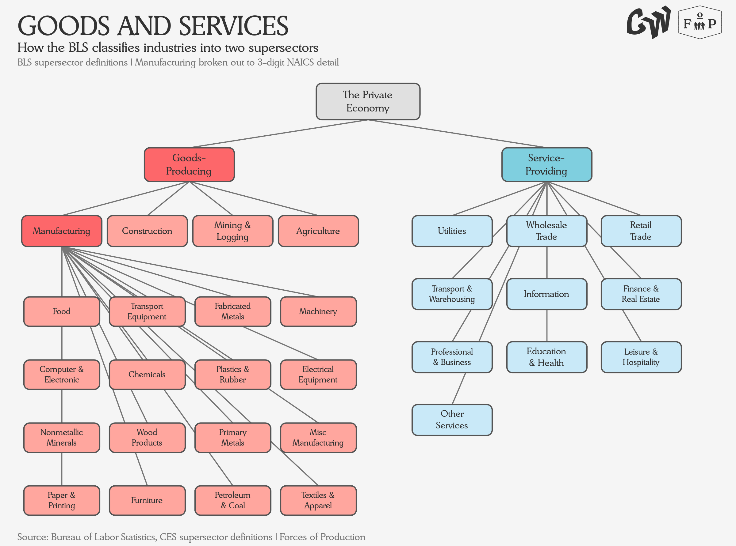
Now, these all seem pretty reasonable, but the distinction between goods and services is not quite as clean as it looks. The classification system itself, NAICS, does not actually define the difference — it groups industries by similarity of production process, and the goods-versus-services distinction is layered on top by the statistical agencies as a practice.
Goods-producing industries tend to be capital-intensive: they invest heavily in equipment and facilities, they automate where they can, and they generate a lot of output per worker. Service-providing industries tend to be labor-intensive: the work is the product, and generally workers cannot be directly replaced by a machine without changing the service provided. That difference in how capital and labor relate to each other turns out to matter enormously for how the two sides of the economy behave over time.
Let’s look at how these contributions to GDP have evolved by industry, rather than just at the goods vs services level.
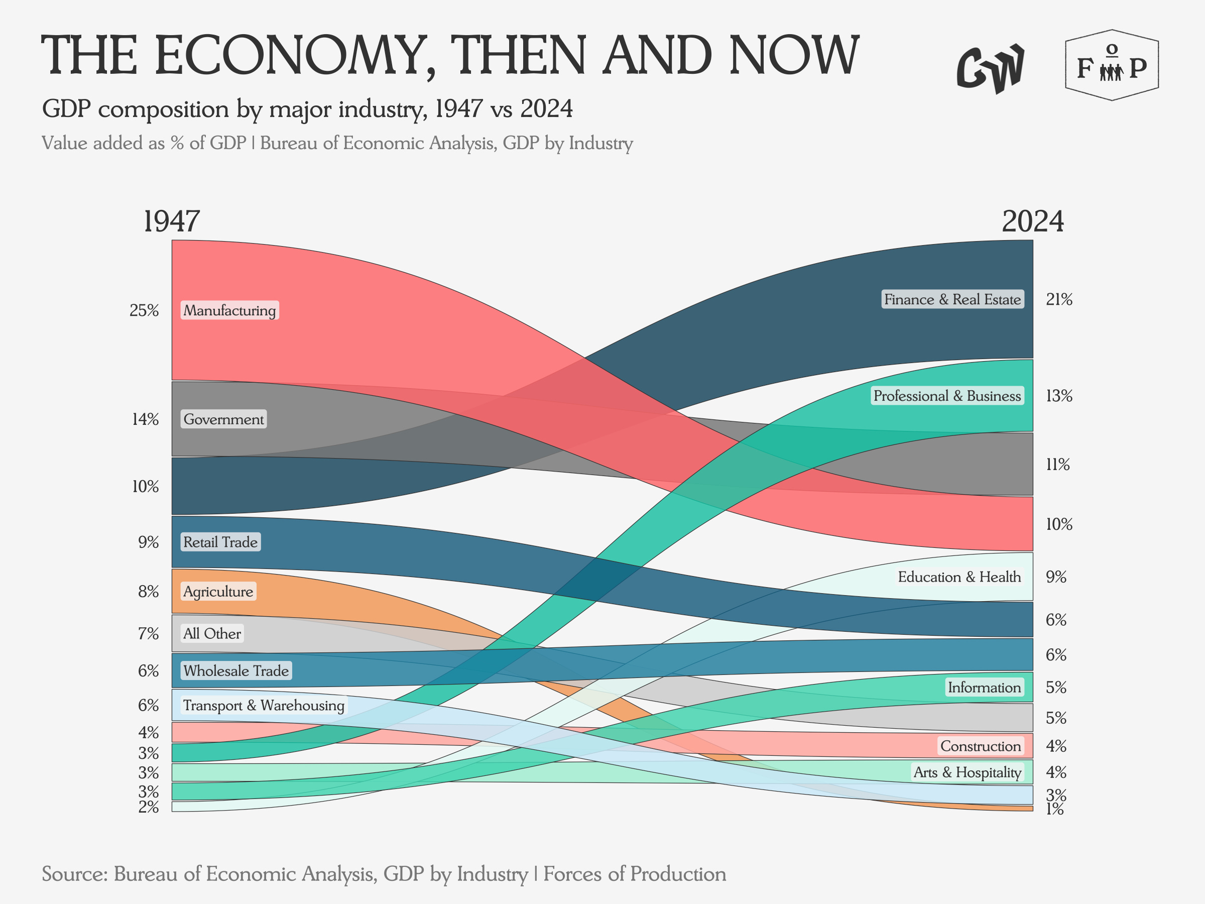
One way to look at this chart is to see a financialization story, where Manufacturing trades places with Finance and Real Estate, as the former slides from 25 percent of GDP to 10 percent while the latter leaps from 10 percent to 21 percent. Another way to look at it is to see that the combined share for Manufacturing, Professional and Business Services, and Finance and Real Estate has risen slightly from 38 percent to 44 percent, suggesting a kind of continuity.
But the supply side is more than just the output as measured by GDP, whether of goods or services. Most importantly, the supply side is employment.
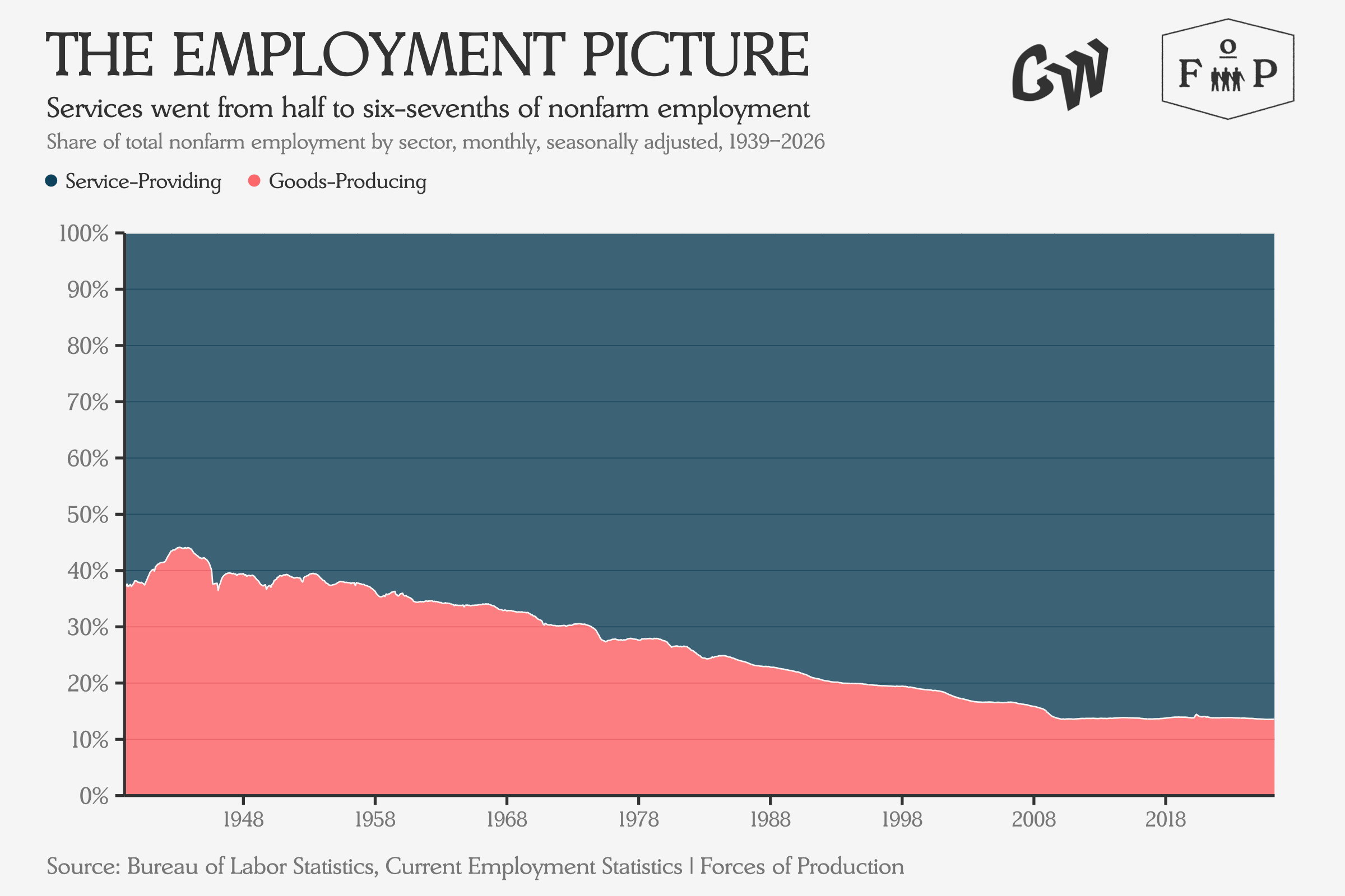
Over the last seventy-five-odd years, service provision grew from half to five-sixths of all employment. Goods production shrank from a third to 13 percent. Agriculture practically disappeared, falling from 15 percent to one percent of employment. Since goods-producing sectors can usually automate production and substitute capital for labor more effectively than service-providing sectors, their share of total employment falling faster than their share of output was to be expected.
So breaking employment down in the same way as GDP, where do people actually work today?
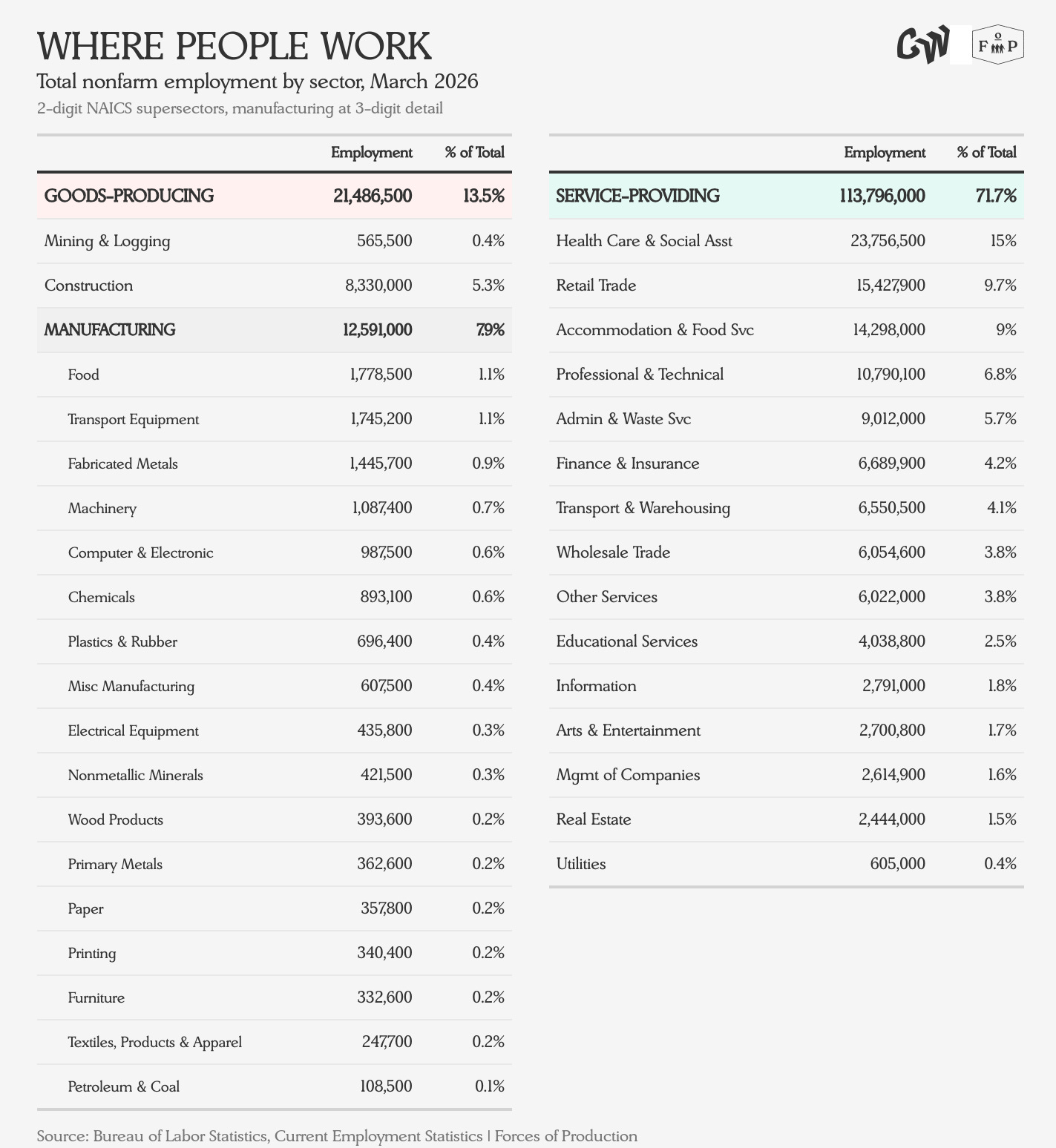
More Americans work in Heath Care and Social Assistance today than in the entire goods-producing side of the economy. Twenty-seven times as many people work in Arts & Entertainment than Petroleum and Coal Products refining. Finance, Insurance, and Real Estate together represent 5.7 percent of employment and 21 percent of GDP.
Sadly, we don’t have granular employment data as far back as GDP data, so in looking at how these employment levels have changed over time, we have to start the clock in 1990.
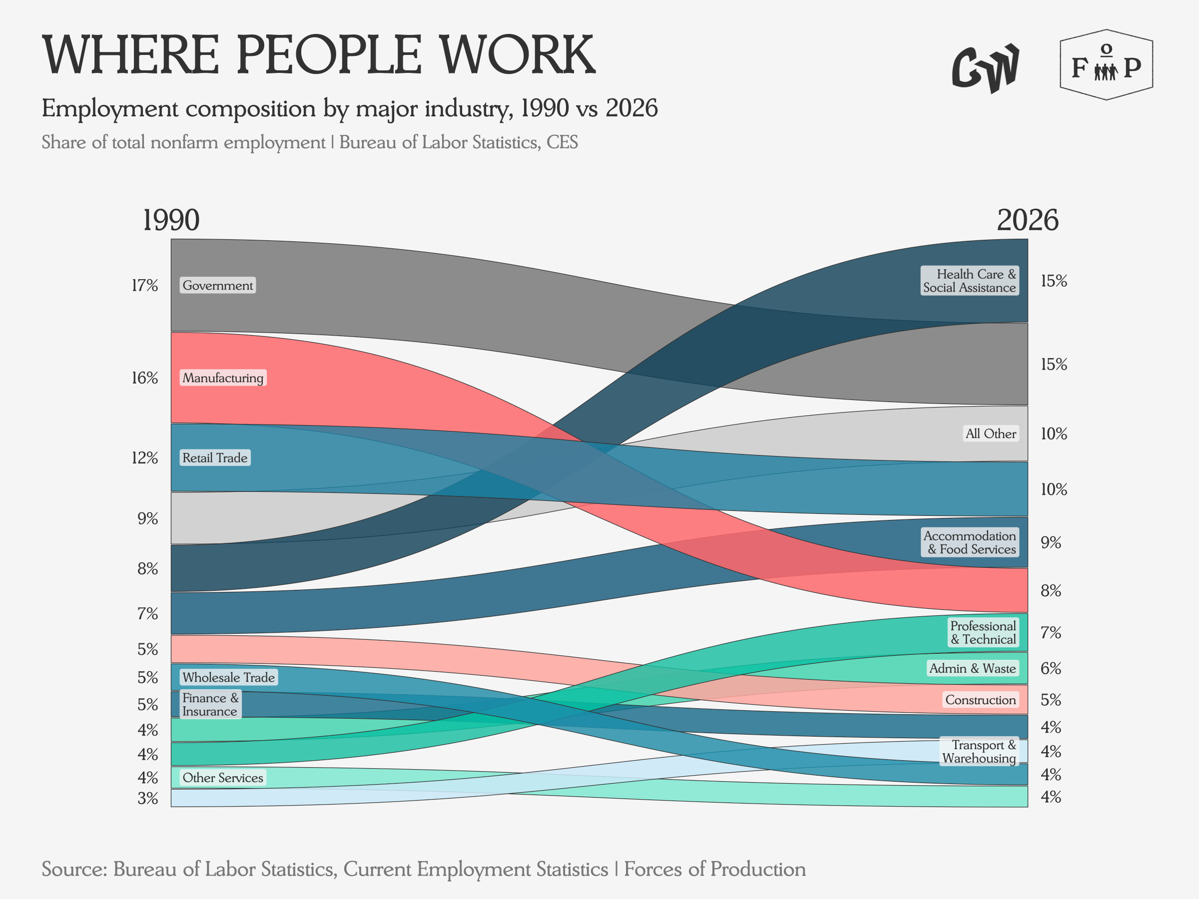
Employment in Health Care and Social Assistance has nearly doubled since 1990 to become the largest employment sector, while Manufacturing has been nearly halved, moving from second to fifth place.
But what do these changes really look like for each sector individually? How many jobs have actually been gained or lost in the changing ranks on the leaderboard?
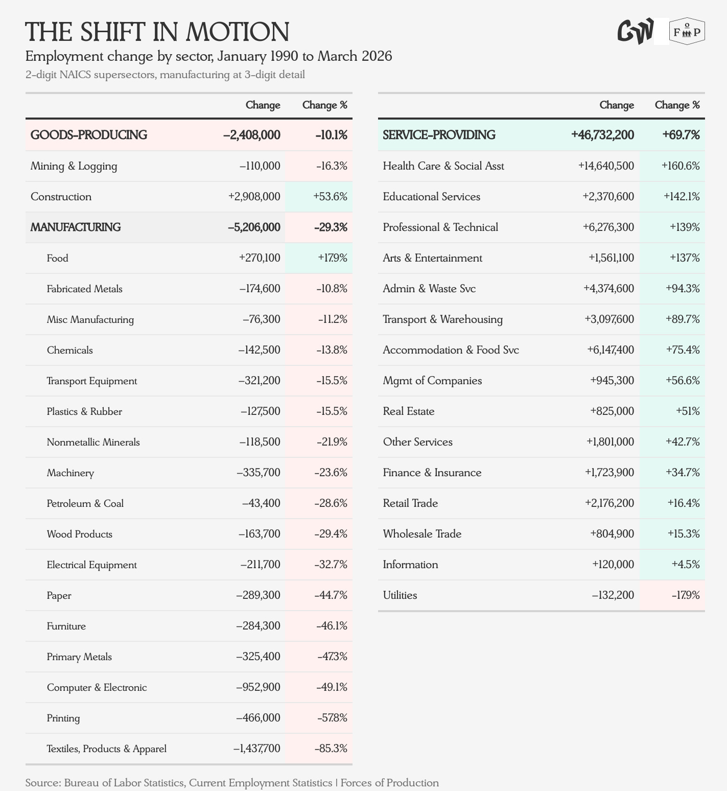
Interestingly, goods-production employment has changed significantly less than service-provision employment has over the past thirty-five years. It did fall, by 10 percent, while the service sector added nearly twenty times as many jobs as the goods-producing side lost.

Looking at the employment transition over time, the role of the business cycle stands out the most. During expansions, service-providing industries add jobs while goods-producing employment largely holds steady. When recession hits, employment in service-providing industries holds steady while the goods-producing industries lose jobs. It is also interesting that even as the share of employment in goods-producing sectors fell precipitously, the absolute number of jobs on the goods producing side has remained relatively range-bound.
This Month’s Data
Employment
Nonfarm payrolls added 178,000 jobs, and the unemployment rate held steady at 4.3 percent, which markets read as supporting the Fed’s decision to hold interest rates. Healthcare and Social Assistance accounted for 76,000 to 90,000 of the total gain, but many of those gains came from workers returning from a strike rather than new hiring. Wage growth continued to cool: average hourly earnings rose just 0.2 percent month-over-month and 3.5 percent year-over-year, the lowest annual pace since May 2021.
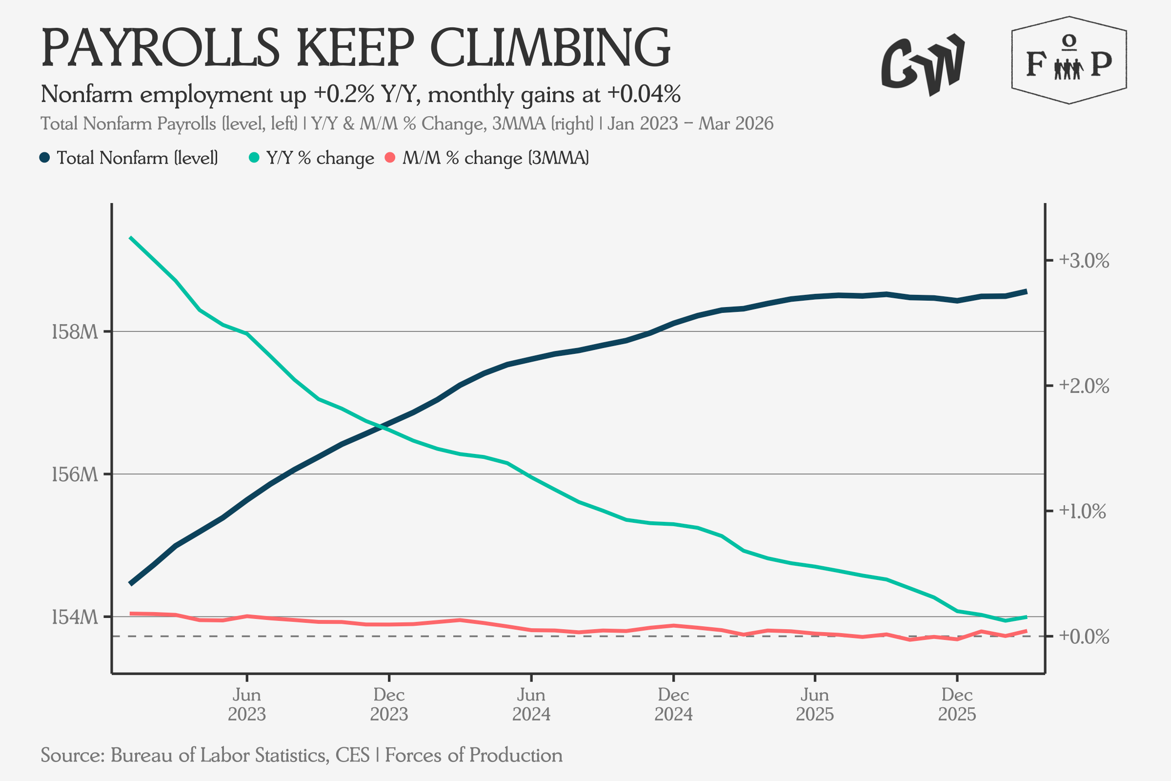
The slowdown over the last three years is the main dynamic here, even if the March jobs numbers ticked up. Indeed’s Hiring Lab argued that despite the headline beat, the underlying labor market is in a “defensive posture” — low hiring, low layoffs, historically low quits. Fortune and Bloomberg both emphasized that the report beat expectations by a wide margin but cautioned that geopolitical headwinds from the Iran conflict and energy price spikes pose downside risks to future job growth.
The overall picture is one of a labor market that appears strong on the surface but whose underlying momentum, after accounting for demographic shifts, is much weaker than the headline suggests.
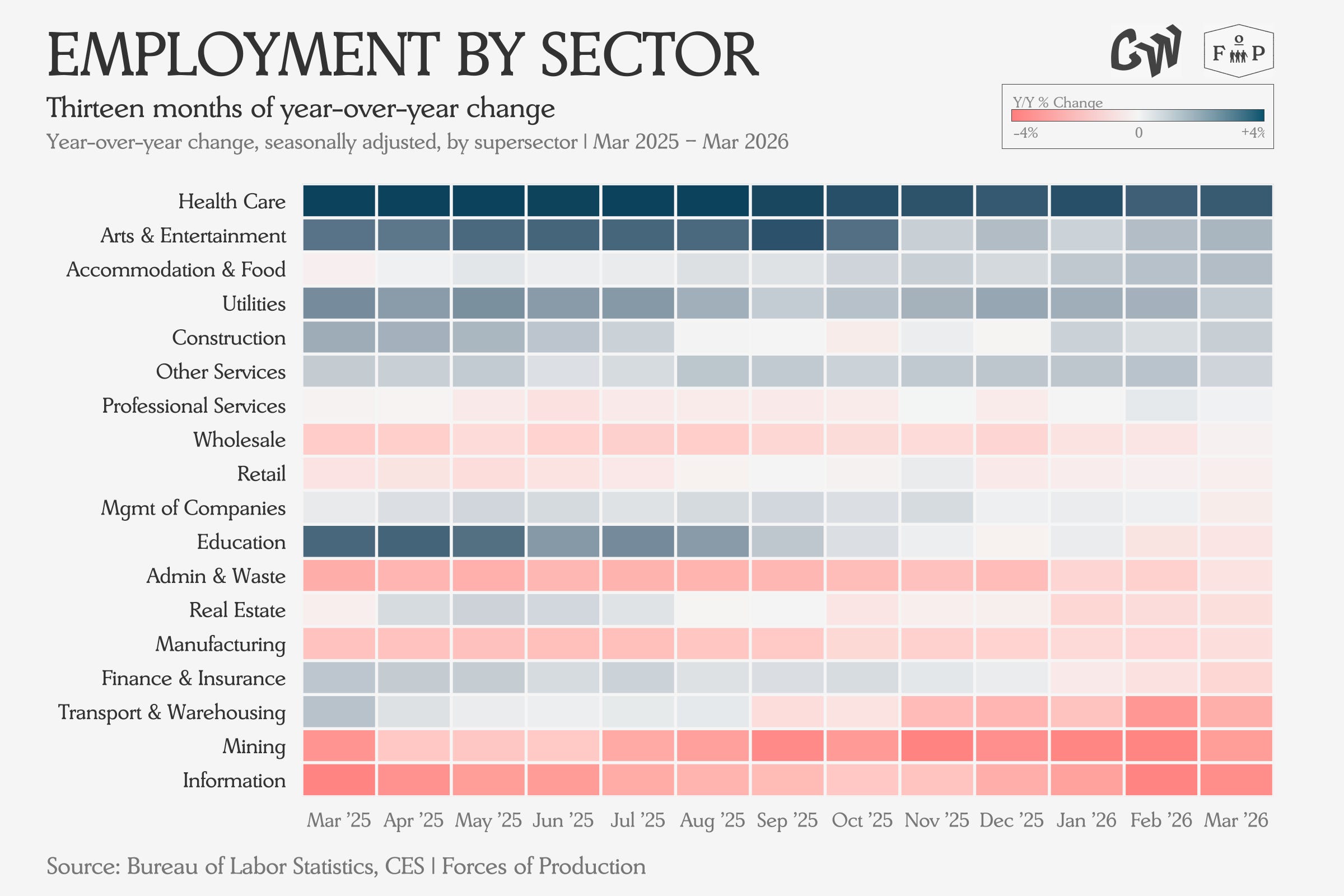
The sector heatmap confirms the story of strong growth in Health Care employment against broad-based weakness.
Industrial Production and Capacity
The March 2026 industrial production report missed expectations, with total industrial production falling 0.5 percent month-over-month against a forecast increase. Capacity utilization fell to 75.7 percent from 76.1 percent, landing 3.7 percentage points below the 1972–2025 average of 79.4 percent.
Defense and space equipment production rose 3.2 percent, aerospace grew 6.2 percent, and computer and electronic products gained 3.6 percent — all sectors benefiting from CHIPS Act investment, defense spending related to ongoing conflicts, or both. Business equipment was up 4.6 percent year-over-year.
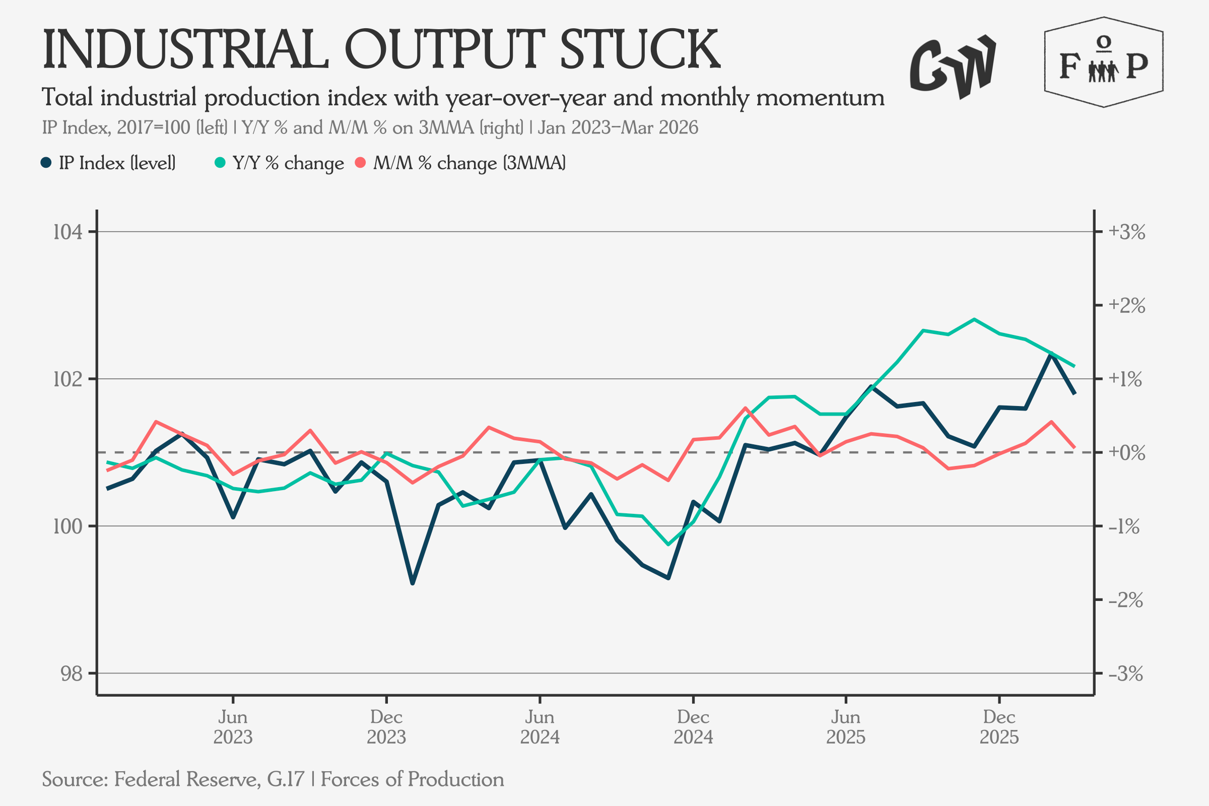
We continue to see a rebound in the industrial production data over the past year. While recent readings have turned down, ultimately the index has remained remarkably steady.
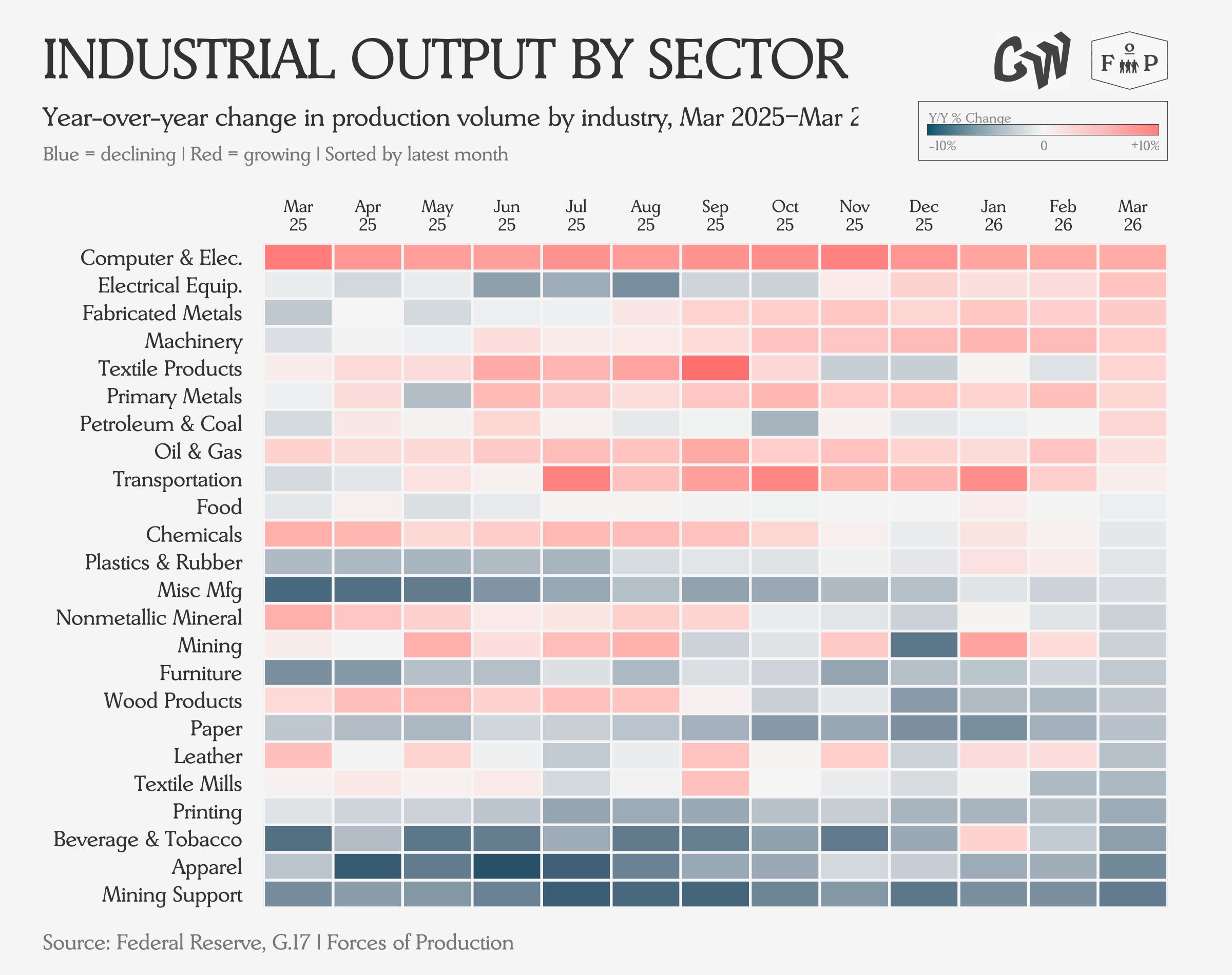
Output growth remains the strongest in Computer and Electronic Products, as well as Electrical Equipment, both sectors whose products remain will remain in high demand throughout the data center buildout and decarbonization processes, while over half the industries show output contracting year-over-year.
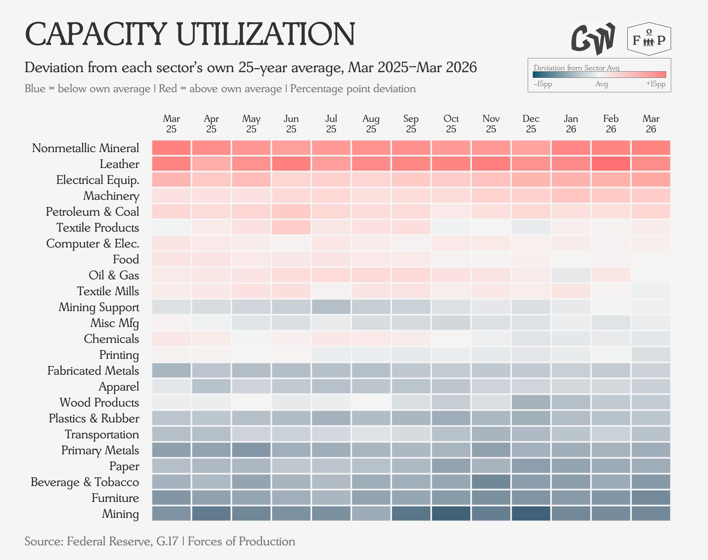
Capacity Utilization largely confirms the production data, with the bulk of the manufacturing economy sitting below historical utilization rates, while Electrical Equipment utilization rates continue to confirm high demand for the sector’s products.
Prices
The PPI release on April 14 offers partial relief from the hot CPI earlier in the month. Producer prices for final demand rose 0.5 percent month-over-month — well below the consensus forecast of 1.1 percent. But to be clear, All Goods PPI still hit 4 percent, the highest since February 2023.
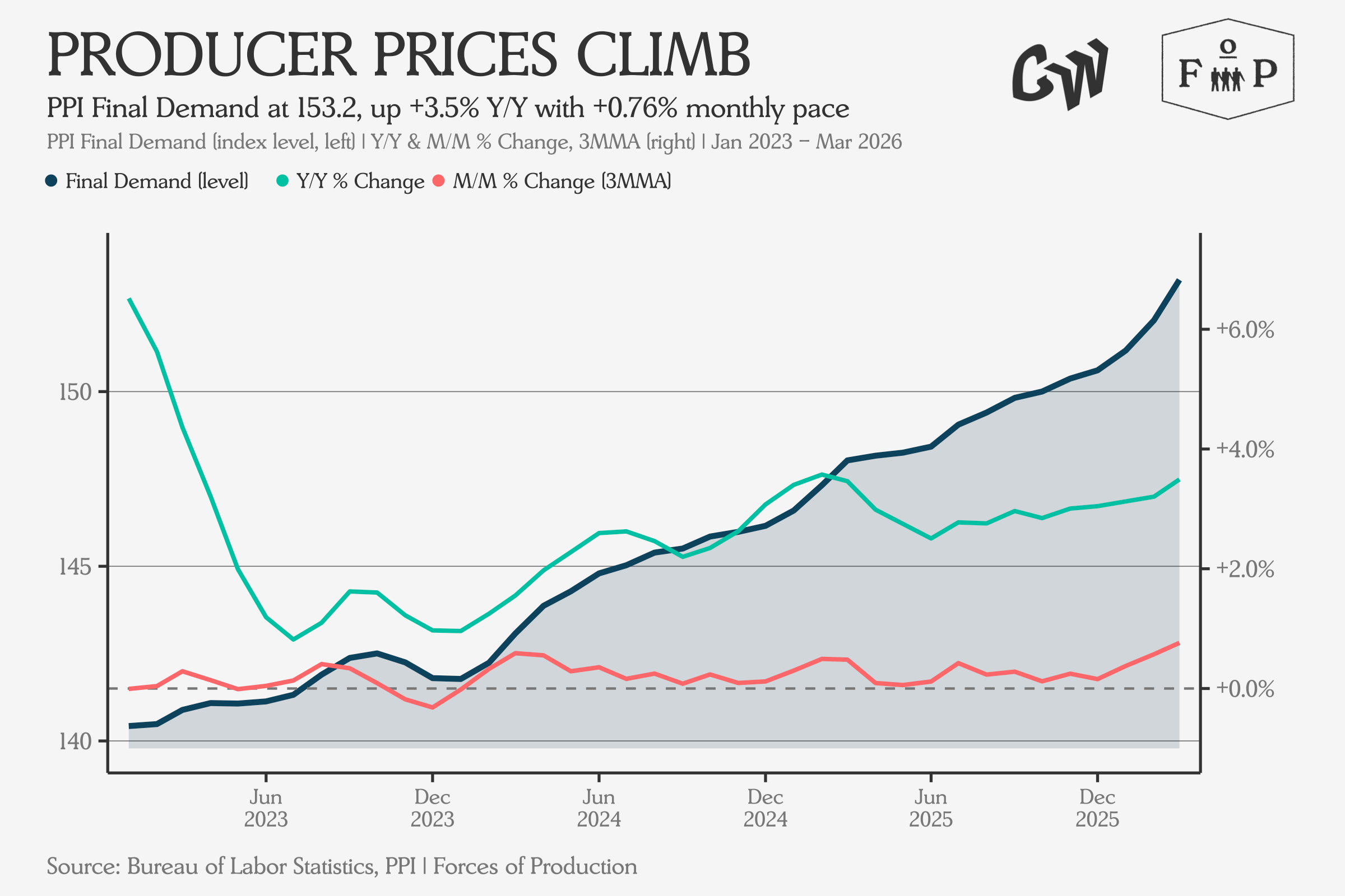
The combined CPI-PPI picture: consumers are already feeling the energy shock at the pump, but the measured pass-through to broader producer prices has so far been less severe — the question now is not whether the pipeline pressures (intermediate goods, tariffs) will push future readings higher, but just how high they will go.
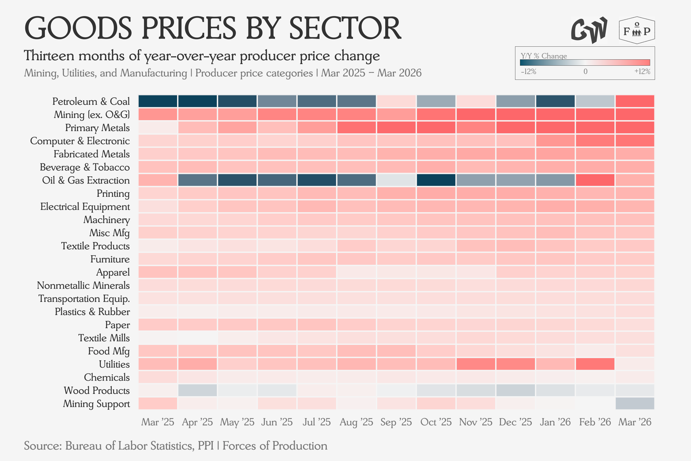
Perhaps the funniest thing about this table is the Strait of Hormuz closure causing the sudden flip of Petroleum and Coal Refining from a source of disinflation to the clear inflation leader at the top right: from light blue to dark red.
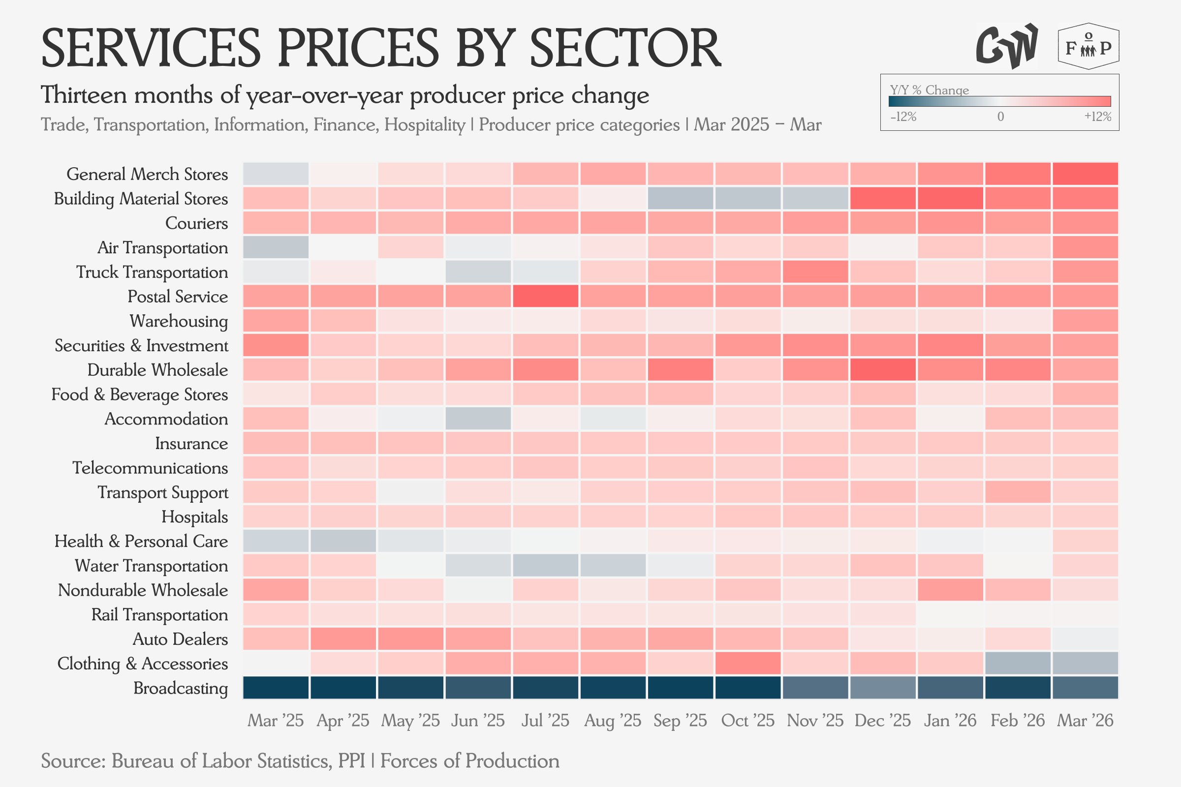
On the services side, everything but Broadcasting saw rising prices.
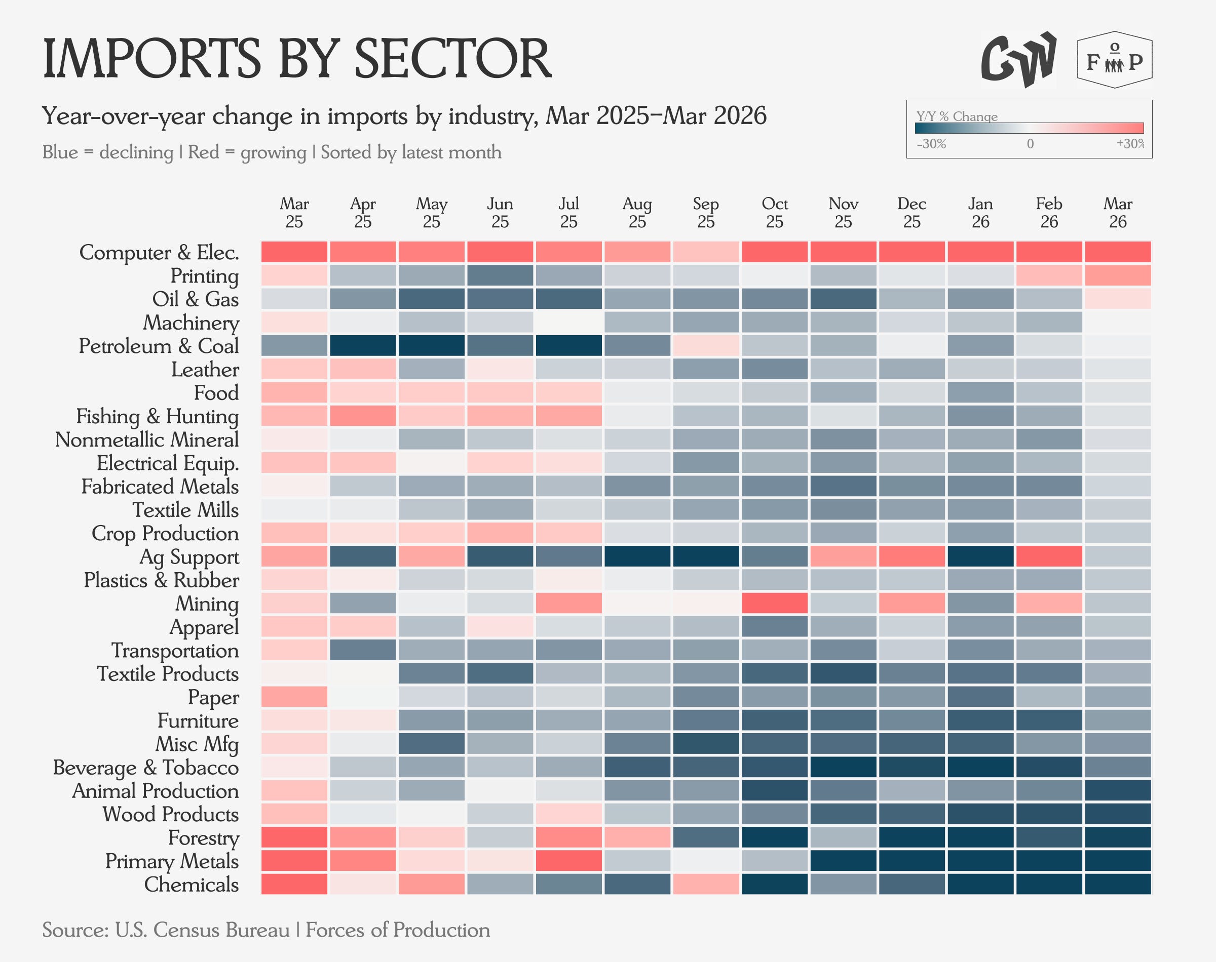
Trade
The March 2026 international trade report, released by Census and BEA on May 5, showed the trade deficit widening to $60.3 billion — up 4.4 percent from February’s $57.8 billion. Imports rose 2.3 percent to $381.2 billion while exports grew two percent to $320.9 billion. On the export side, the Iran conflict was visible: fuel exports rose roughly 25 percent as Middle East disruptions pushed US energy exports higher.
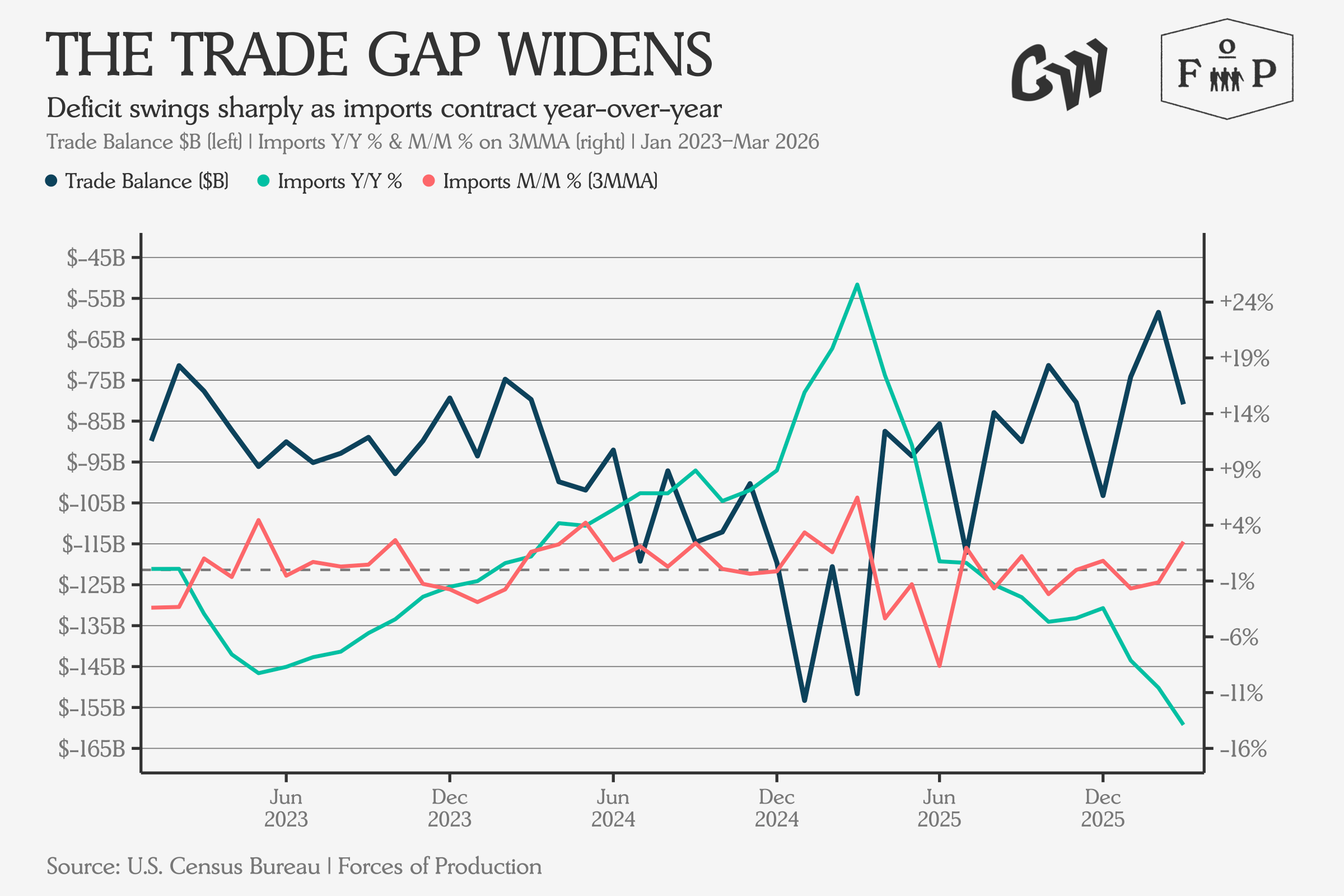
Yet the dominant story was AI infrastructure spending. Capital goods imports hit a record $120.7 billion, driven by computer equipment, semiconductors, and accessories for data center buildout — computer accessories alone surged by $2 billion in the month. The most structurally significant analysis came from the Federal Reserve Bank of Minneapolis, covered by Fortune: AI-related products now account for roughly 23 percent of all US imports. AI imports grew 73 percent since 2023 while non-AI imports grew just 3 percent.
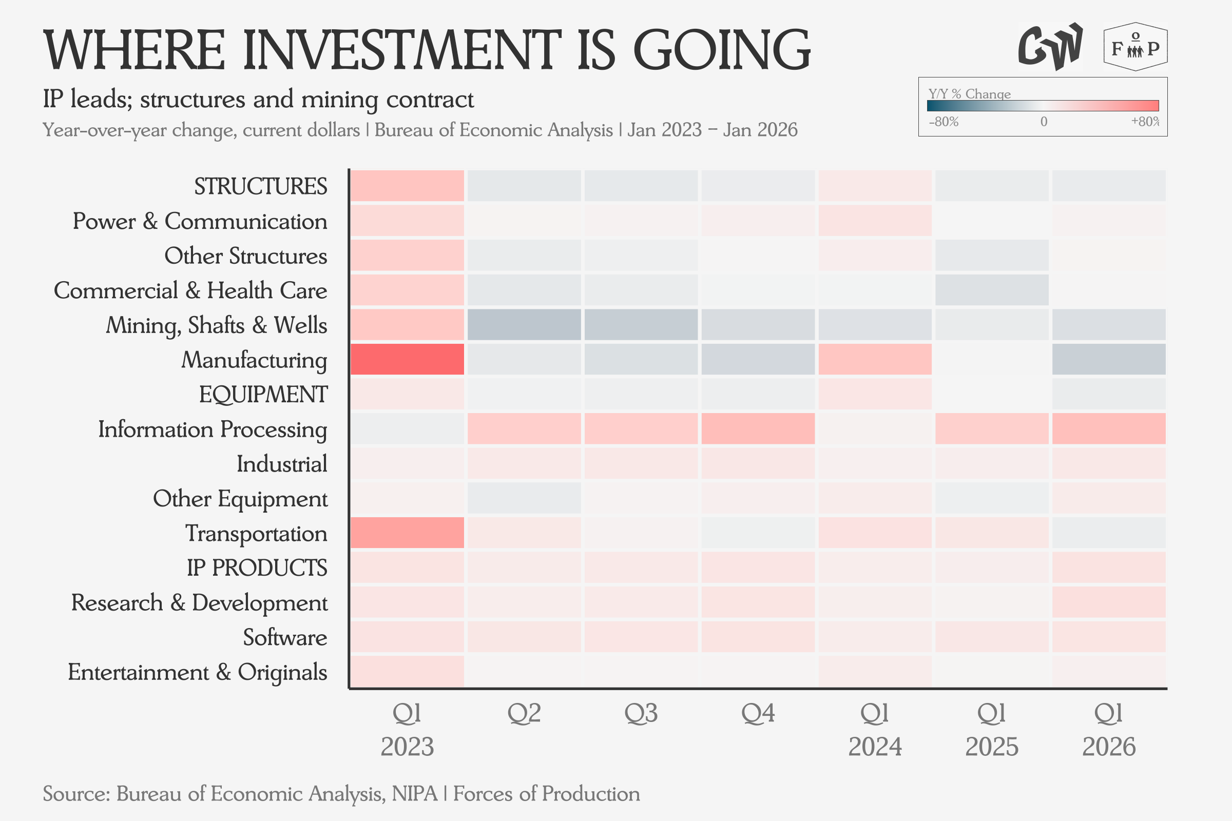
Investment
The Q1 2026 GDP advance estimate showed real GDP growing at a 2.0 percent annualized rate: a significant rebound from Q4 2025’s 0.5 percent but still below the consensus forecast of 2.3 percent. But structures investment — both residential and nonresidential — declined, with manufacturing structures leading in the nonresidential drop.
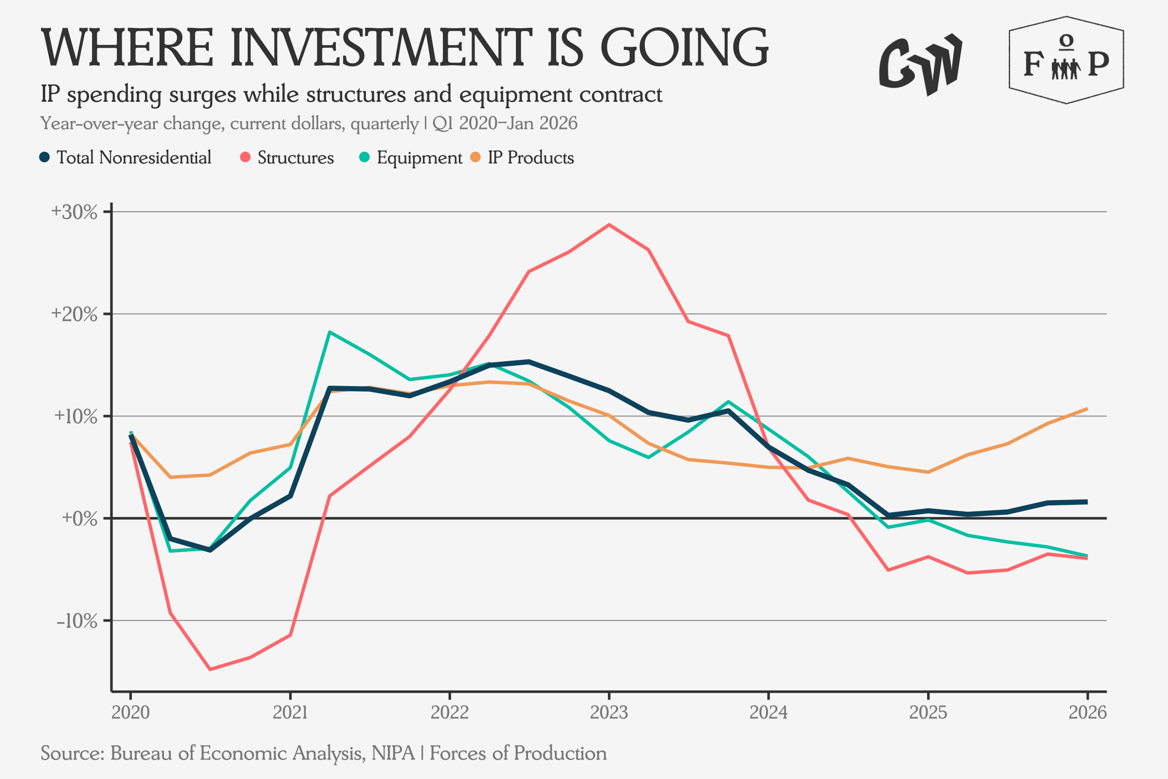
Bloomberg and The Washington Post both led with the AI investment story — Bloomberg calling it the “primary growth engine” and the Post noting that equipment was up 17 percent quarter-over-quarter. The broader picture: the US economy in Q1 2026 was being pulled forward by AI-driven capital investment and dragged by energy-cost-driven inflation eating into consumer purchasing power.
How It All Adds Up
The economy is still in limbo. The Iran war and its oil shock hang over every dataset this month, being visible directly in energy prices and indirectly in the caution underlying hiring and industrial production decisions.
But the overall picture is one of an economy that is constrained by supply, rather than demand. That changes how everything works — unemployment stays low even as job creation slows, because there are fewer workers to employ. Inflation stays sticky because businesses cannot expand output by adding people and the two biggest structural forces in the data are pulling in different directions. Investment is flowing into AI while employment is flowing into healthcare — the only sector consistently adding jobs at scale, absorbing workers that the rest of the economy is learning to do without.
Whether those two currents will complement each other or compete for the same resources is the question the next few months of data will start to answer.